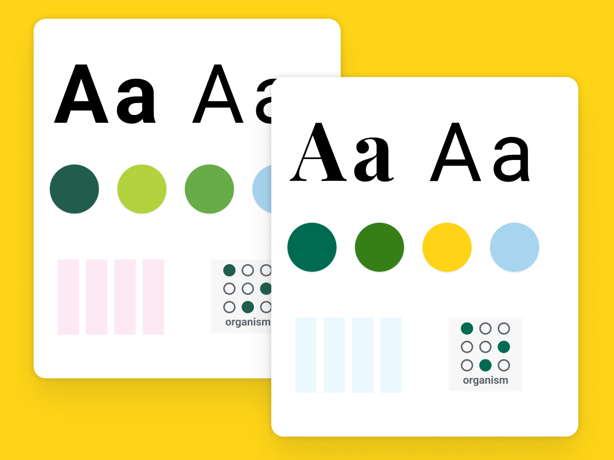
A design system for the University of Vermont
A scalable design system to unify their online brand
Project overview
Challenge
Many of UVM’s roughly 400 websites have developed their own design, palette, and typography and quite a few are on different platforms. With decentralized web management, a lack of shared digital brand guidelines and over 1,000 content editors, the challenge was to both update the design of the website and make sure that it doesn’t erode going forward.
SOLUTION
- Recommended developing a design system in lock-step with the redesign of UVM’s website
- Created the Trail Mix design system, an evolving digital ecosystem where the atomic building blocks of UVM’s digital brand live along with hand-off documentation, assets, links to interactive prototypes, usage guidelines and links to their GIT repository.
- Move from a template-driven approach to a component approach
- Empower content creators with a library of flexible, scalable components that meet the range of content display needs for all level of content
- Make content creation easy with enough clear choices so content administrators have creativity without the ability to go off the rails
- Provide layout structure where a consistent content strategy and presentation is desired to enhance user consumption and content comparison. For example, course and program descriptions.
My Role
- UX Design
- Design Lead
- Product Design
- Design System Author
Tools
Figma, Sketch, InVision DSM, InVision Freehand, InVision Prototyping, Jira, Photoshop
Status
The Trail Mix design system is a part of a multi-brand design system with the new Ivy design system. Trail Mix will be retired as the evolving newer Ivy brand is applied to all 400 UVM web properties.
Trail Mix design system
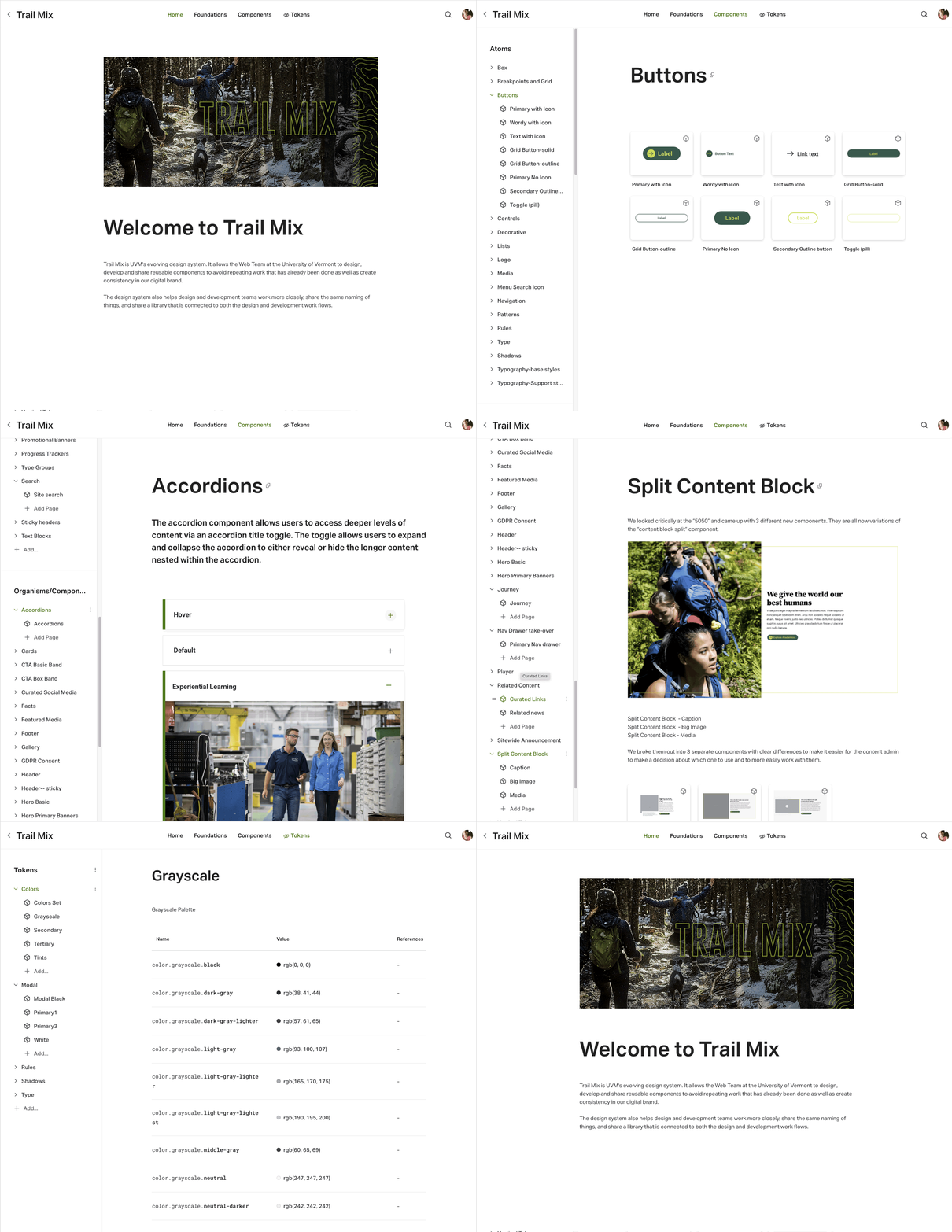
Embracing an atomic design approach as a part of the redesign and creation of the design system
It’s not a guiding principle, but how we could do more with less always made its way into the discussion. With any team, it’s important to be mindful of resources and not create a lot of design bloat or development debt.
After the foundations were layed down for the design system, components were designed based upon parameters outlined in a creative brief and a functional description.
Components went through rigorous edge case testing to make sure they meet content needs and that the design holds together with minimum and maximum content at all breakpoints. Progressive enhancement and UI changes get considered for optimal user experience at different breakpoints, platforms, and viewing scenarios.
Each component had to pass the scrutiny of our Guiding Principles to ensure quality and accessibility. We also wanted to make sure we were employing the breath of the atomic system and weren’t creating a new component when one already existed. Each new component gave us the opportunity to evaluate the scalability of our product. Iteration happened mostly at the pencil sketch and wireframe stages but occasionally it made sense to dip back and iterate something existing to improve its scalability.
The structure of the design system was also planned for usability and consumption by content creators.
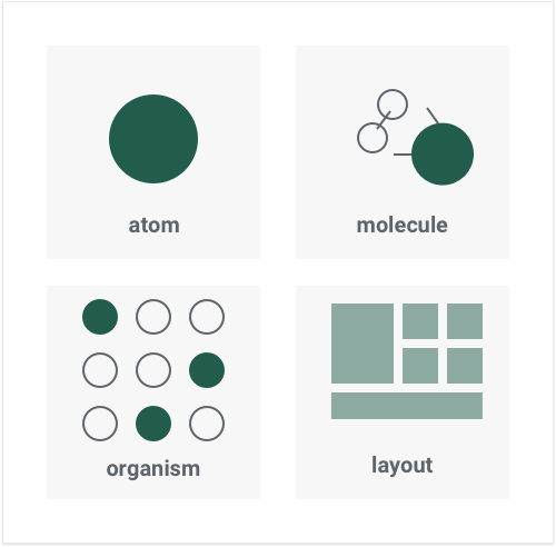
Core UI and foundations first
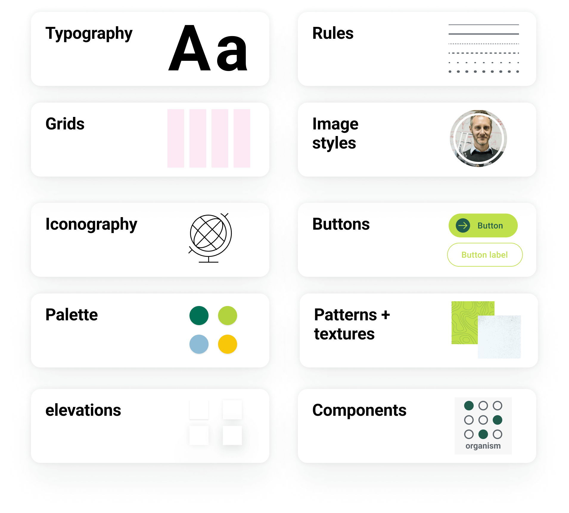
After discovery and a visual inventory of the multitude of patterns on the site, I started laying down the foundations and core UI of the design system:
- Guiding principles
- Palette
- Rules
- Typography
- Iconography
- Breakpoints and grids
Responsive breakpoints and grids provided the framework to layout all levels of content. They helped create order and consistency in layout as well as provided a structure to work out how design products at all levels responsively scale across different breakpoints.
DESIGN Solution
Eliminated design and interface inconsistencies
Limited options for the display of different types of content and the ability for content editors to add source code to do HTML via inline hacks, had created a lack of consistency in their digital presence. There was a lot of variety in the palette, typography, image styles, iconography and user interface.
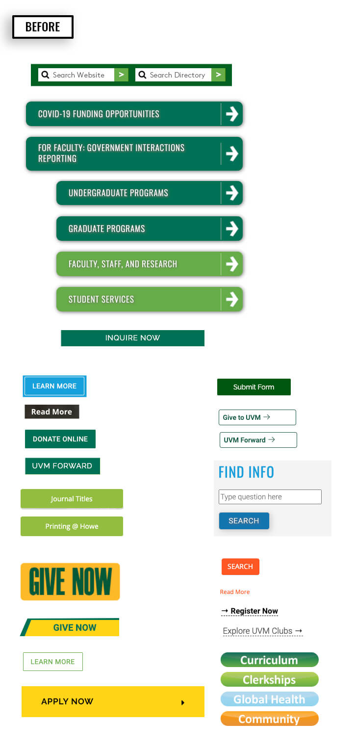
Button design variations grew like a fungus. This “BEFORE” example is a collection of buttons gathered from an audit of the university’s websites.
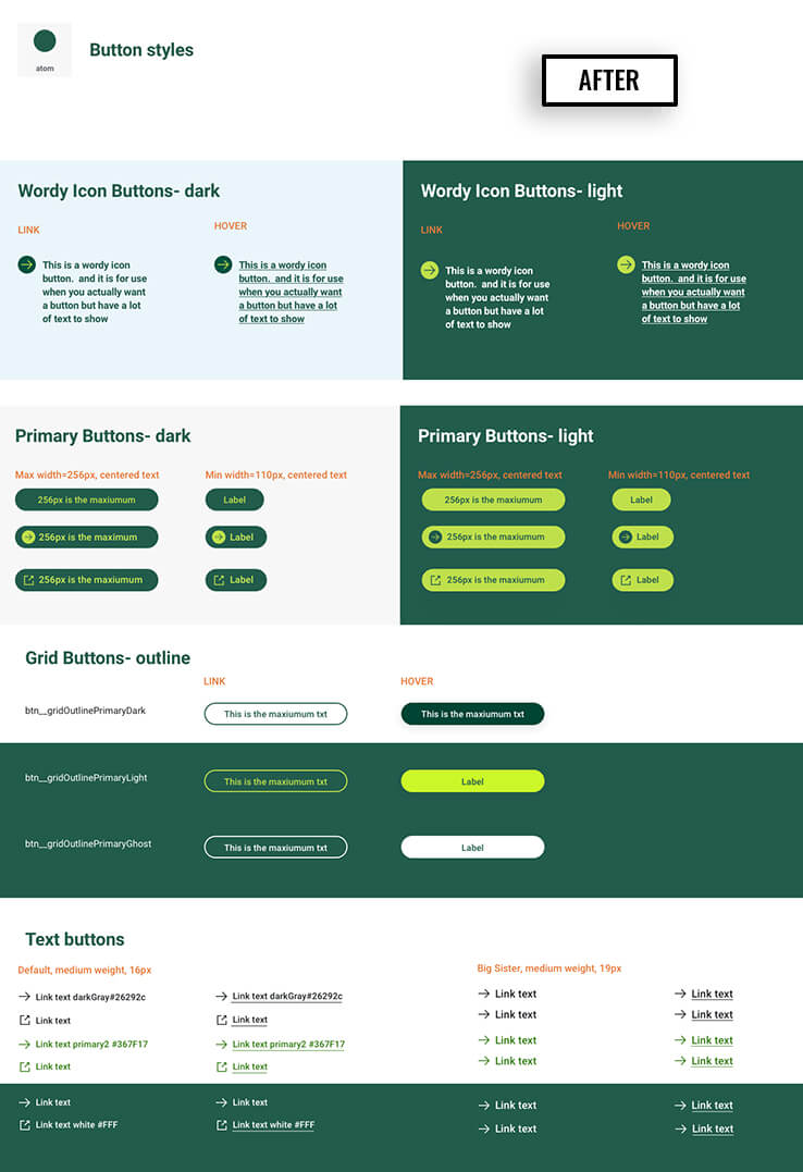
The “AFTER” shows the new button designs with variants to meet the needs for heirarchy, call-to-action emphasis, lable length and purpose.
Created an accessible palette
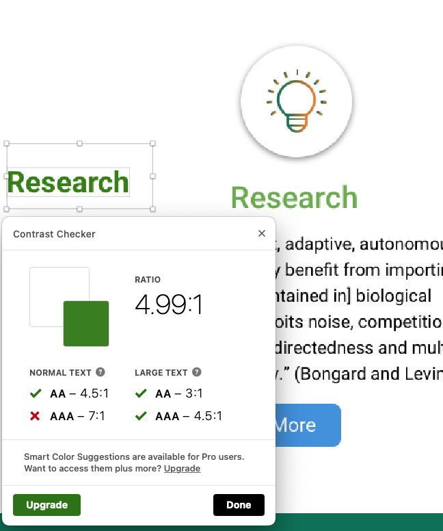
I extended the print-based brand palette to the web, adding tints, filling out the grayscale and neutrals and tested contrast to ensure that color combinations met WCAG AA standards, at minimum. I also worked out color pairings for type and backgrounds.
Some type styles use an rgba color value. The alpha state with white and dark gray, created an “onDark” and “onLight” style that can be used on a wide range of background colors and appear consistent in value across light and dark background – while still meeting the WCAG contrast standard.
Guiding Principles
Early on in the process, we defined some guiding principles to help in end-to-end decision making about design, user interface, coding, copy and content creation, user journeys- you name it. They inform decisions, and they keep us from going off the rails.
We design for people
Our work is user-centric. We don’t loose track of who we are communicating to and we don’t arrogantly assume we know what our users’ need or like. We advocate continually testing with target user groups so we can learn about and understand our users so we can create products and communications that add value.
We embrace accessibility
We embrace diversity and strive to create an inclusive, accessible experience for everyone. We embrace accessibility guidelines and take them into consideration in our end-to-end process. They are not an after thought. They are baked in to our process and everything we do.
We build for consistency and scalability
Consistency helps us align our visual brand, our communication teams, and our values. It helps us design to scale using a common language. It’s a key driver of the design system and unifies our brand across each touchpoint.
We design with purpose
Our work is purposeful and designed to inform, engage and meet real needs. We develop tools, features and functionality to better meet the needs of our content creators and the audiences that they serve.
Responsive component design
Components were designed to responsively scale to provide an optimal user experience for different viewing scenarios, devices and resolutions. Breakpoints provide the opportunity to reset and adjust the layout or apply progressive enhancement while scaling up from mobile.
LAYOUTS
Putting components to the test with actual content
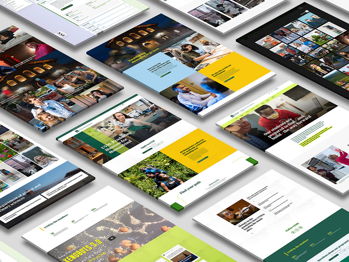
Representative layouts were made with real content to provide examples of how different components can be combined to meet the communication needs of different schools, colleges, units, programs, and departments while providing engaging journeys for site visitors.
These layouts provide a useful reference as to how the components can work to communicate content strategy.
Outcomes
Designing atomically and building out the Trail Mix design system in lock step, had a lot of advantages.
- Allowed us to leverage, scale and reuse our work
- Streamlined the hand-off from design to dev
- Reduced both design and engineering time
- Helped us to better meet the needs of our content editors
- Created brand clarity and design consistency
- Helped deliver consistent and intuitive interfaces
- Baked accessibility into our design products
- Increased collaboration and sharing of knowledge and assets
The design system grows in lock-step with what we release to the development team. Here is a list of what’s been designed and is in development.
Foundations
Guiding principles
Grid and breakpoints
Spacing
Typography
Iconograpy
Interactions
Onboarding
Atoms
Box
Buttons
Controls
Decorative
Media
Patterns
Rules
Elevations
Molecules
Button Groupings
Captions
Controls
CTAs
Facts
Images
Inputs
Lists
Progress Trackers
Type Groups
Organisms
Accordions
Cards
CTA Basic Band
CTA Box Band
Curated Social Media
Facts
Featured Media
Footer
Gallery
GDPR Consent
Header
Header-Sticky
Heros
Player
Related Content
Sitewide Announcement
Split Content Block
Vertical Tab
Wayfinder
Check out Trail Mix for yourself
The latest release of the ever-evolving design system has a public link.
You may also like
Component-driven marketing landing page
Marketing landing page design to raise product awareness for B-Corporation Seventh Generation.
Higher-ed website redesign
Redesign following the atomic design approach for The University of Vermont
Evolving a brand using multiple design systems
How a multi-brand design system in Figma was used to evolve a brand and meet an aggressive redesign launch deadline.
