Perfecting the split content block
Project overview
Challenge
As a part of the redesign for the University of Vermont, they needed a way to elevate messaging in short copy blocks that could take either an image or video and an optional call to action.
Goals
- Design visually strong components that can quickly communicate with impact
- Scale design to use the least assets and minimize programming
- Keep distinct differences so usage is clear for content creators
Audience
External audiences: website visitors. Internal audiences: content creators.
Results
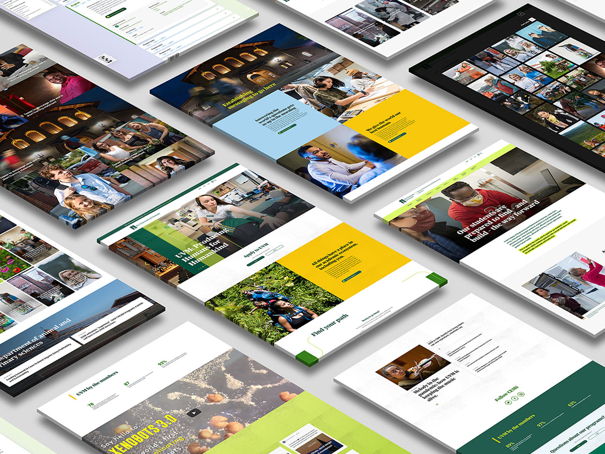
Four variations on the split content block with distinct differences fulfilled distinct and different content display needs so as not to create design bloat.
My Role
- Visual Design
- Product Design
- Component Definition
Tools
Sketch, InVision DSM, InVision Prototyping
Status
Interface passed usability tests. Project assets getting migrated to Figma and are in InVision DSM for hand-off to the development team.
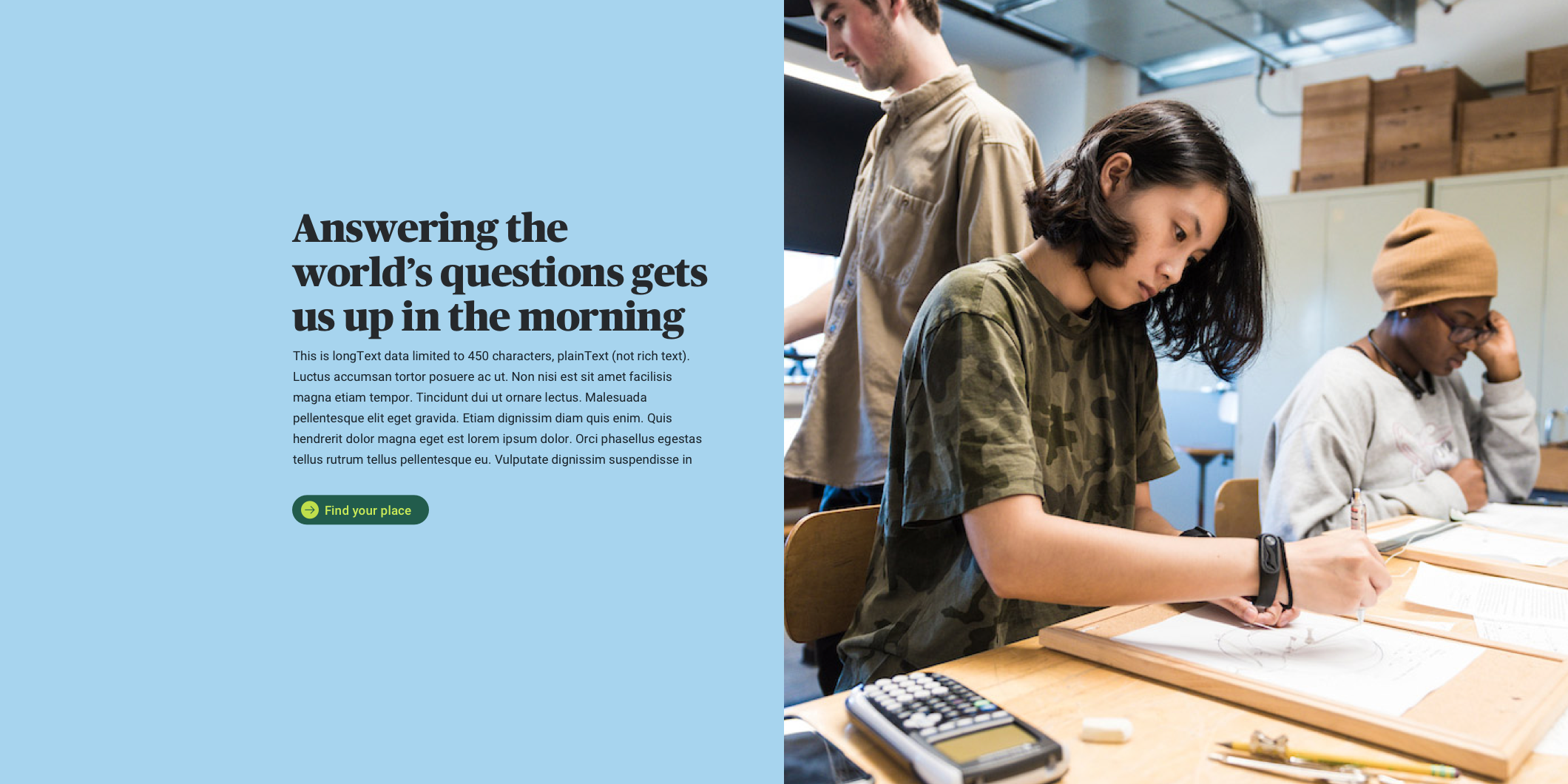

BIG IMPACT
Split layout with a big impact
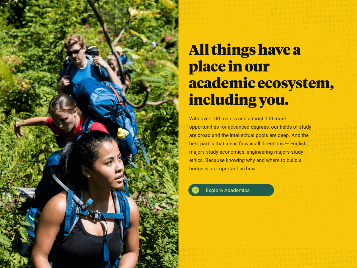
The first responsive split content block component was designed to elevate key messaging, feature strong photography about the University, provide focus with short copy blocks, and coax users to deeper levels of the site with clear Call to Actions. With the big blocks of color, this component is designed to call attention and increase engagement.
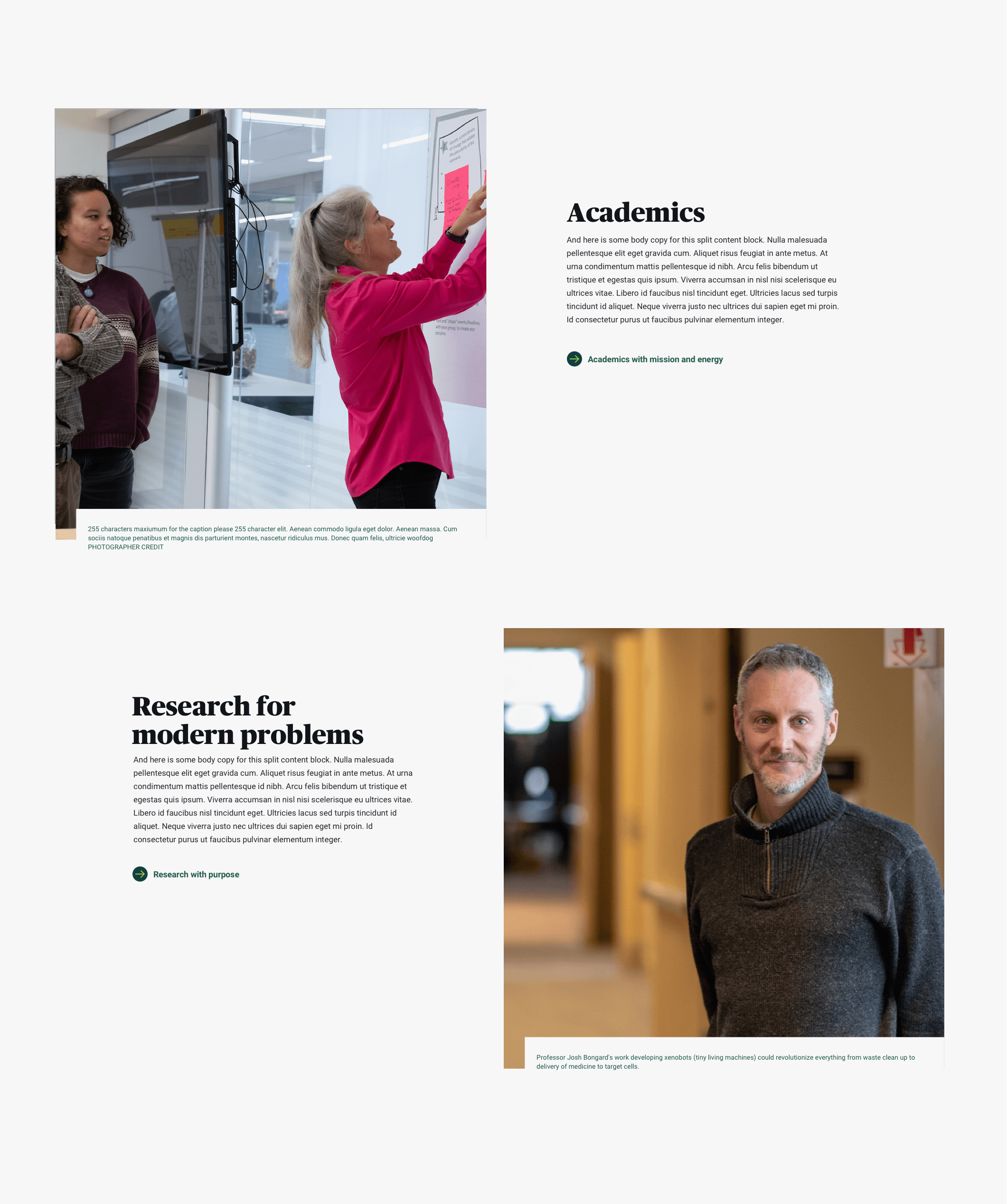
IMAGE WITH CAPTION
Split content layout with a captioned image
This component also features photography, but at a fixed aspect ratio and has a mandatory, cutaway caption. The Call to Actions can be more wordy and accommodate longer text.
Clear component differences helps content creators make easier decisions as to which component will fulfill their content and communication need and helped me, the product designer, write clear usage guidelines.
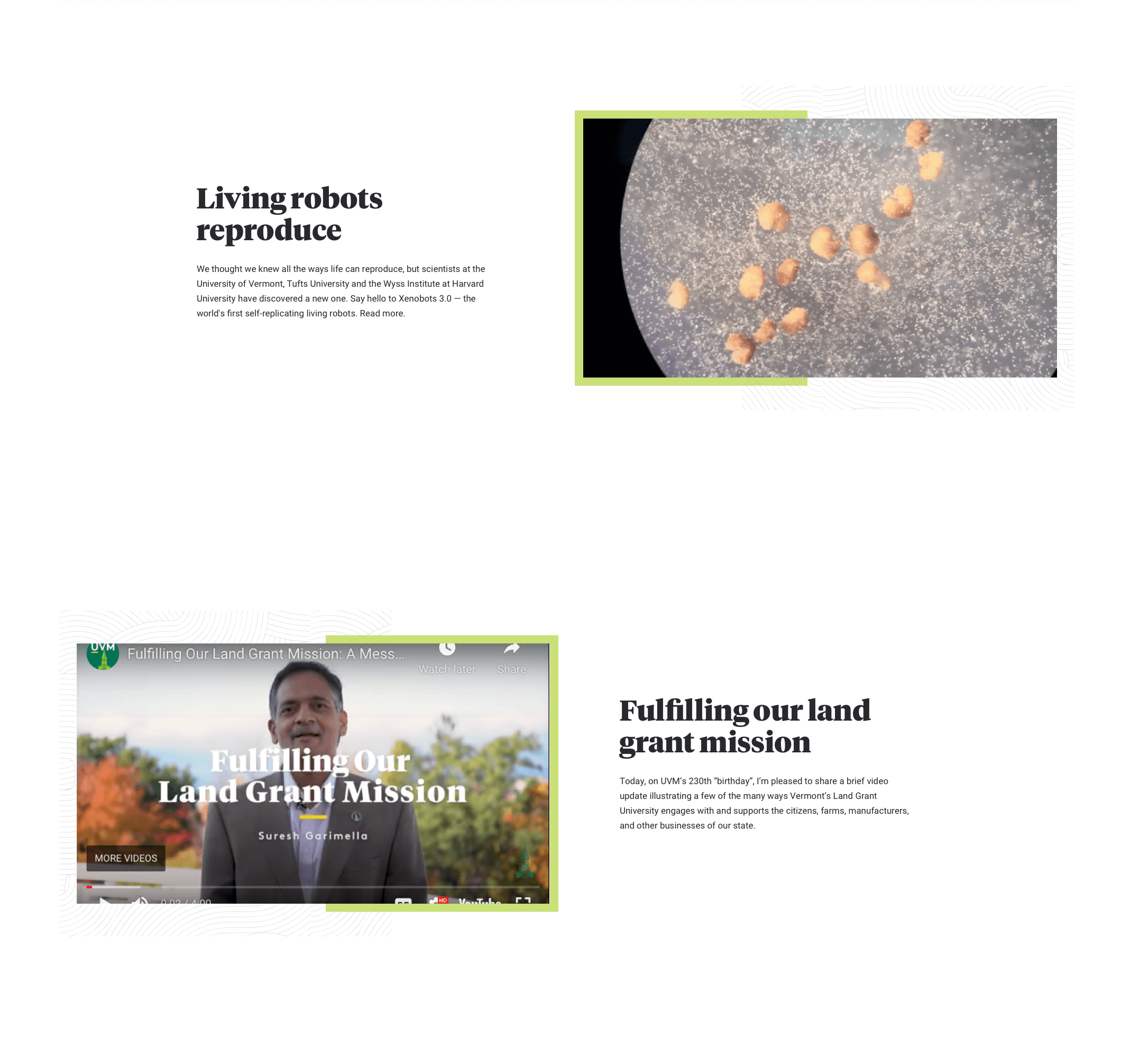
16×9 Media
A split content block that takes 16×9 media
This component is designed to accept 16×9 video or image content in its native aspect ratio. Videos are hosted on YouTube, use the YouTube video controls skin and UI, and import easily with a URL.
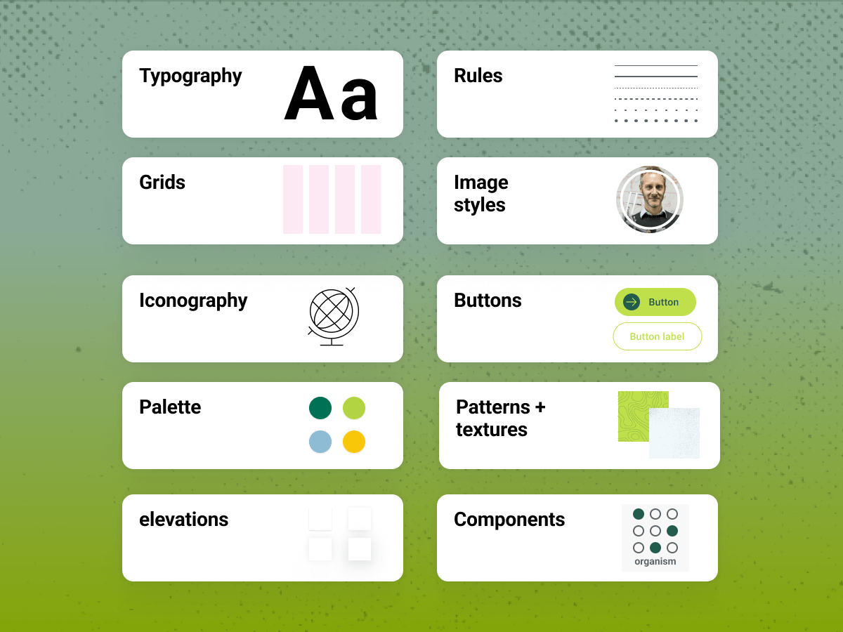
Decorative brand design elements add value by filling out some of the real estate on the screen that a 16×9 media element affords.
Call to Action is optional in this component since the primary goal is for the site visitor to play the video.

Responsive component design
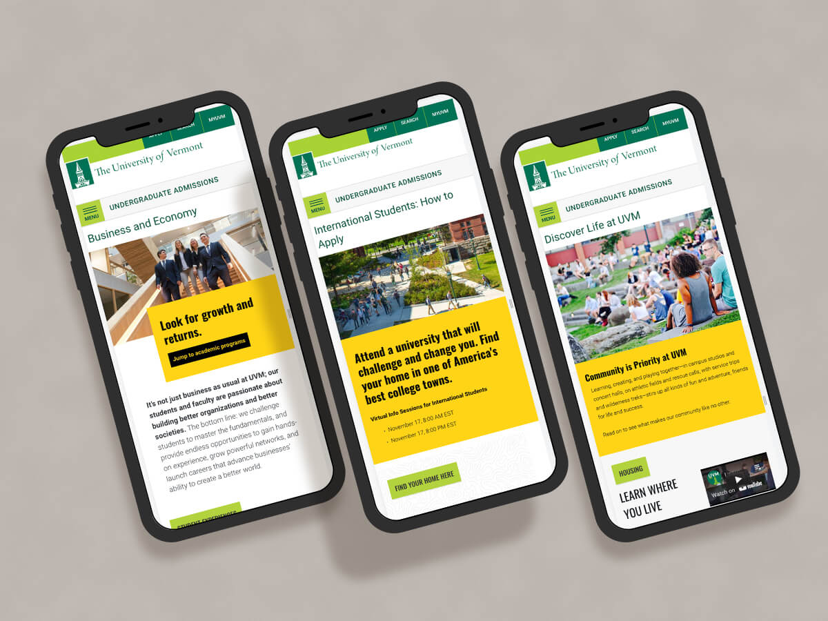
Components are designed to responsively scale to provide an optimal user experience for different viewing scenarios, devices and resolutions. Breakpoints provide the opportunity to reset and adjust the layout or apply progressive advancement while scaling up from mobile.
This component takes advantage of Drupal 9’s image focus tool which allows content editors to manually establish the central focus area on an image and then scale and crop around that focal point, depending on the responsive breakpoint. This ensures that the optimal image size is served up by viewing scenario and that the focal part of the image remains in view.
You may also like
Redesign of a higher-ed recruiting website
Undergraduate Admissions site for The University of Vermont gets a makeover.
