Multiple display options for identical content
Project overview
Challenge
With the design of the 5050 component, content creators needed a way to elevate messaging through concise copy blocks, multimedia elements, and compelling calls to action. The implementation of progressive design empowered them to streamline asset uploading while selecting the most effective display option from a range of choices.
Goals
- Create impactful and varied components that share common content types.
- Optimize design scalability and programming lift.
- Provide content editors with a range of display choices based on messaging, hierarchy, and layout requirements.
Audience
External audiences: website visitors. Internal audiences: content creators.
Results
Four distinct variations of the 5050 component were developed to cater to specific content display requirements, ensuring a purposeful approach without design redundancy.
My Role
- Product Design
- Scalable Design
- Component Definition
- Design Systems
Tools
Figma, InVision DSM
Status
Live
Thumbnail skeletons showing visual display options

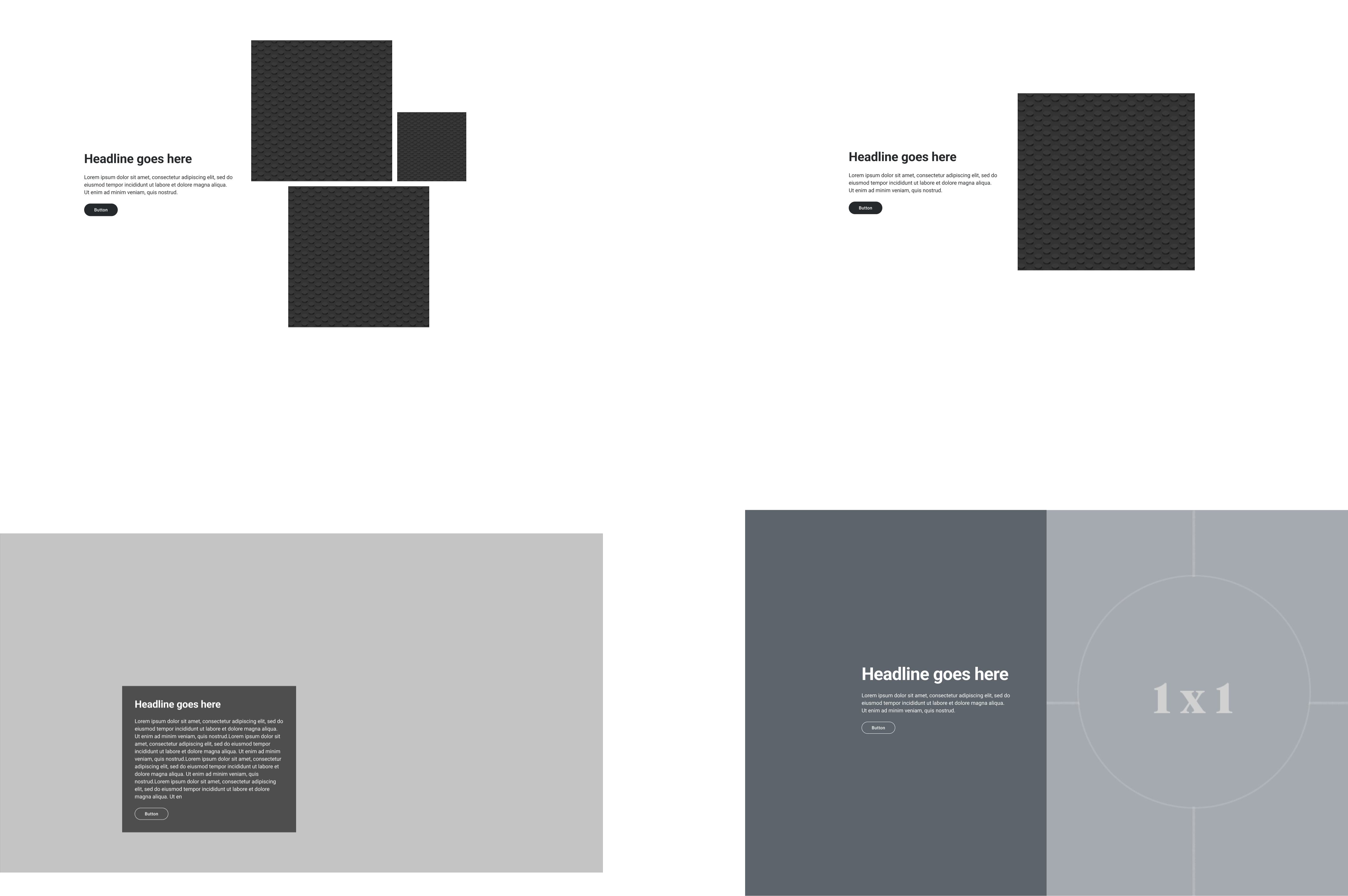
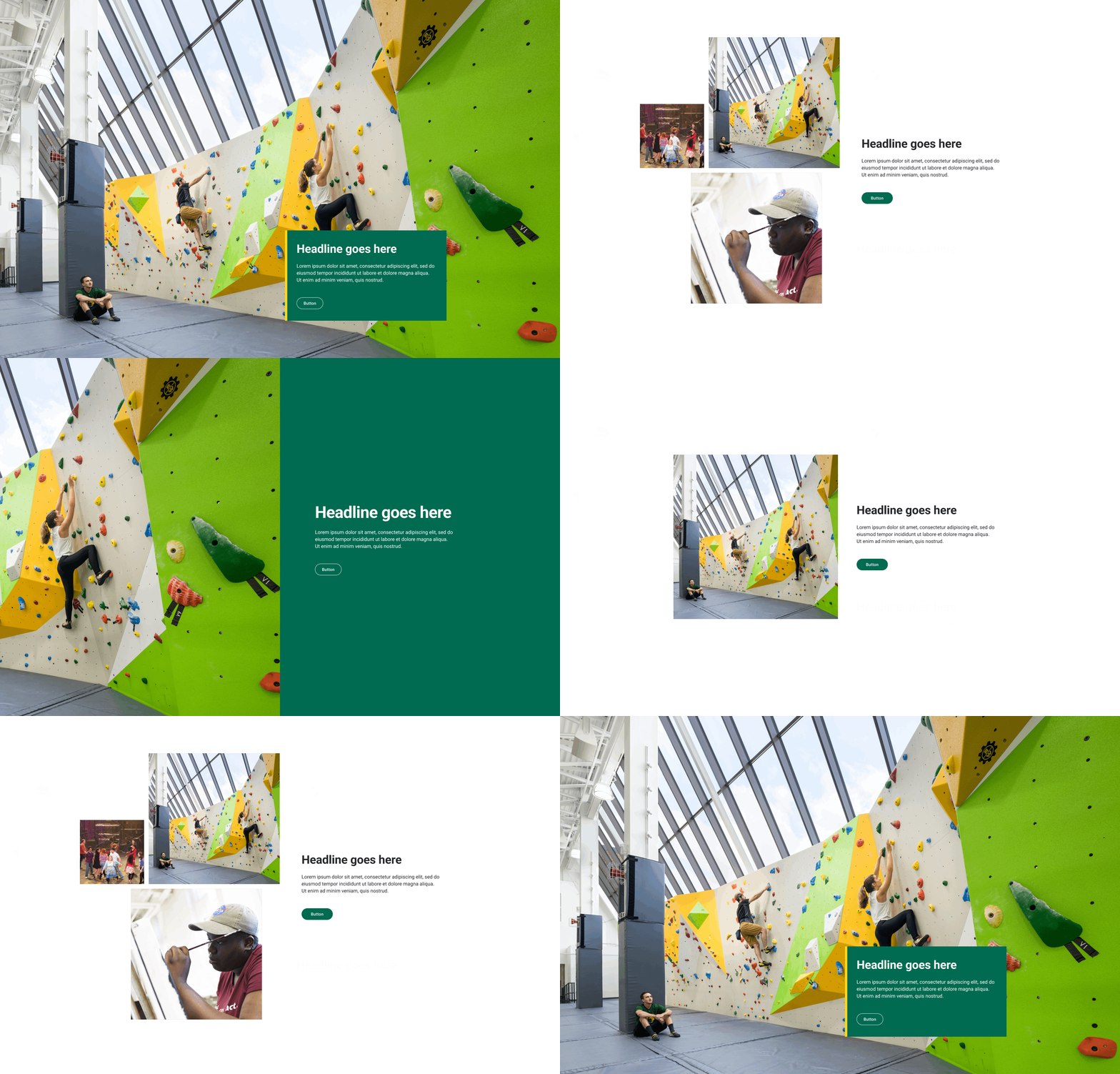
Thumbnail skeletons showing the progressive framework of the 5050 component. Content creators have multiple display options after populating of assets.
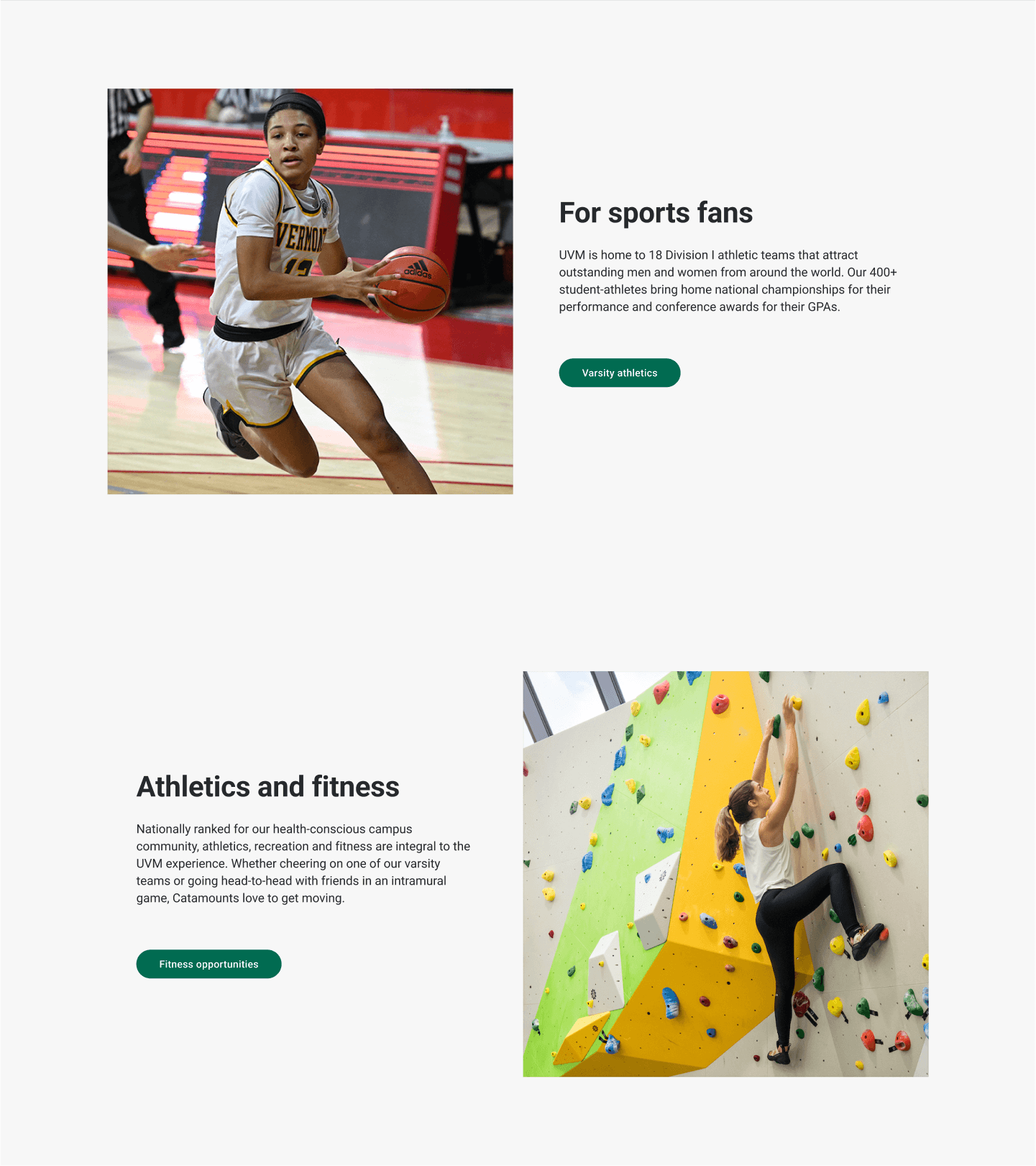
Square Image
5050-image
This component showcases an image cropped to a 1×1 square format, making it suitable for layouts where the same component is used, where on desktop, the image alternates which side it appears on.
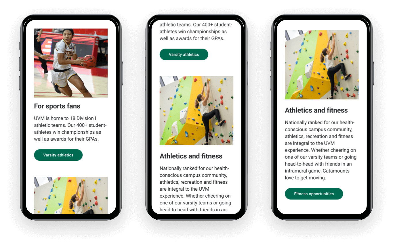
Square Image
5050-image
This component showcases an image cropped to a 1×1 square format, making it suitable for layouts where the same component is used, where on desktop, the image alternates which side it appears on.
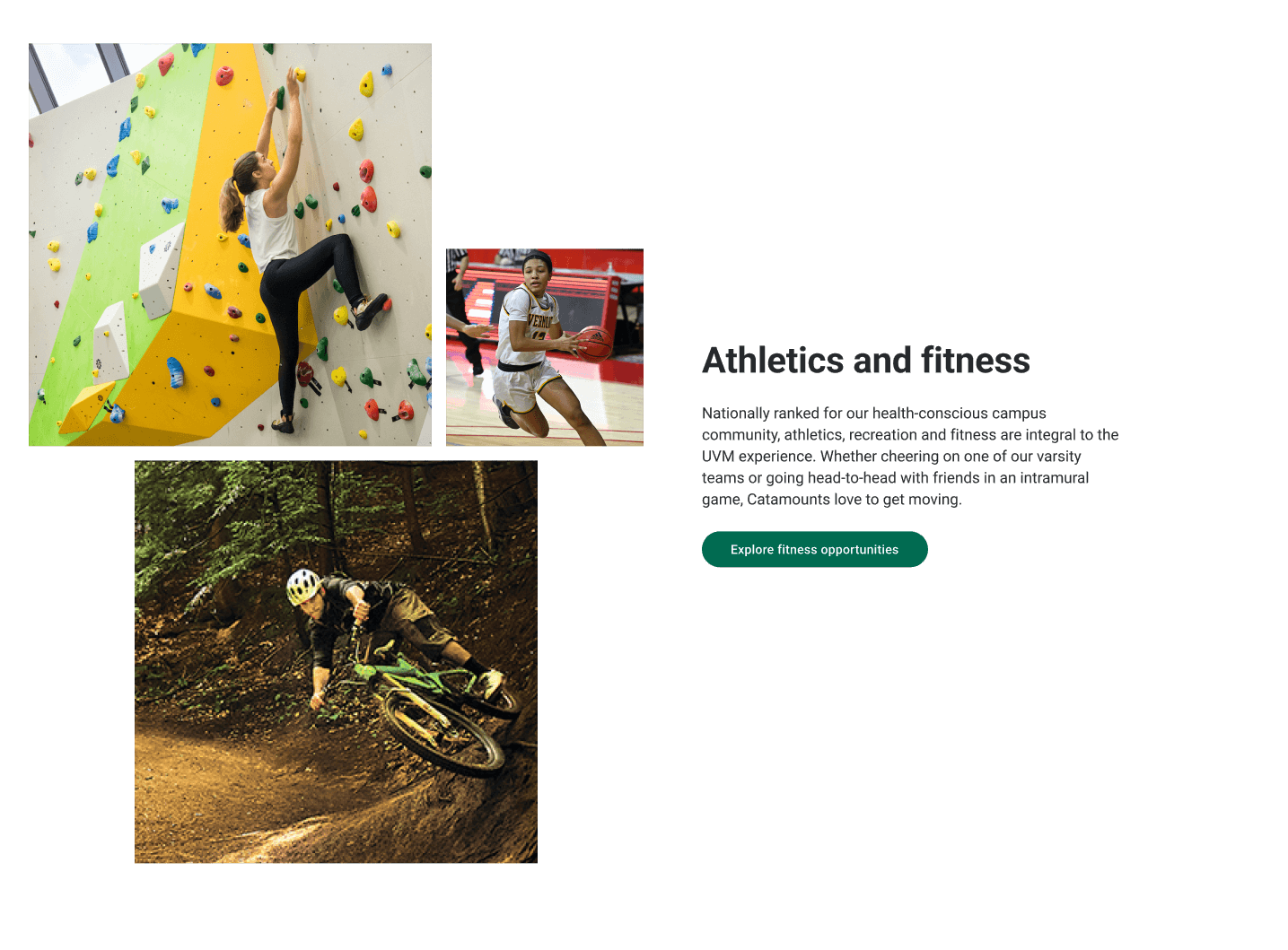
5050 with an image group
This component is used when one image cannot convey the message. A group of three related images adds content value and tells a more complete story. It can be used as a disruptive layout to break up a monotonous left/right layout of stacked 5050 components that displaying just a single image.
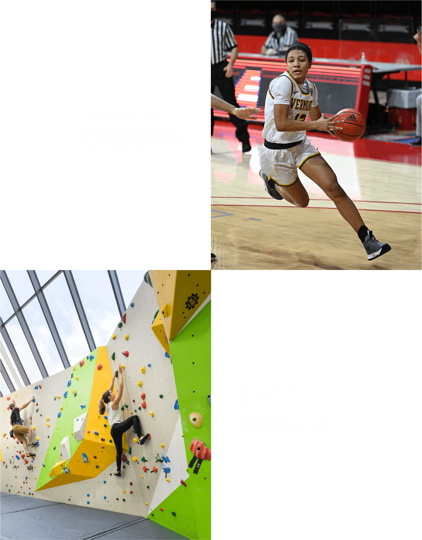
BIG IMPACT
5050 layout with a large 1/2 cover image
This component was designed to elevate key messaging and feature strong photography, provide focus with short copy blocks, and coax users to deeper levels of the site with a clear call to action. This component is designed to call attention and increase engagement.
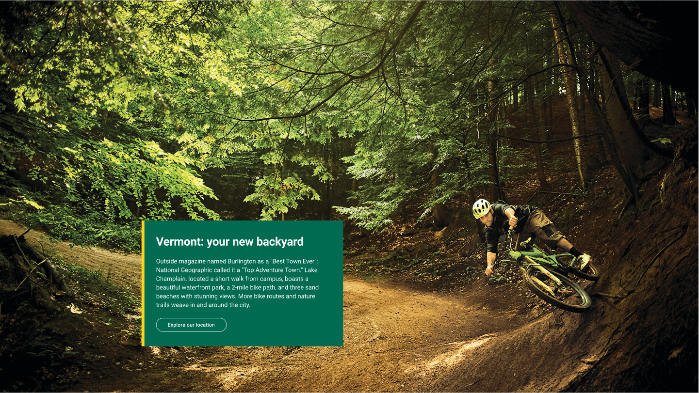
Full width banner with caption overlay
With the use of impactful photography, the full-width banner captures attention and offers a platform for storytelling. Its full-width nature serves to break the pattern of pages featuring either dense or predictably rhythmic content. The optional call to action can direct visitors to take a specific action or be an orienting entry point.
You may also like
Redesign of a higher-ed recruiting website
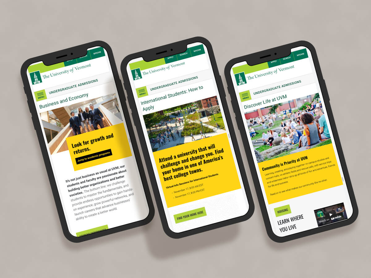
Undergraduate Admissions site for The University of Vermont gets a makeover.
