Higher-Ed redesign
Home page and top tier pages
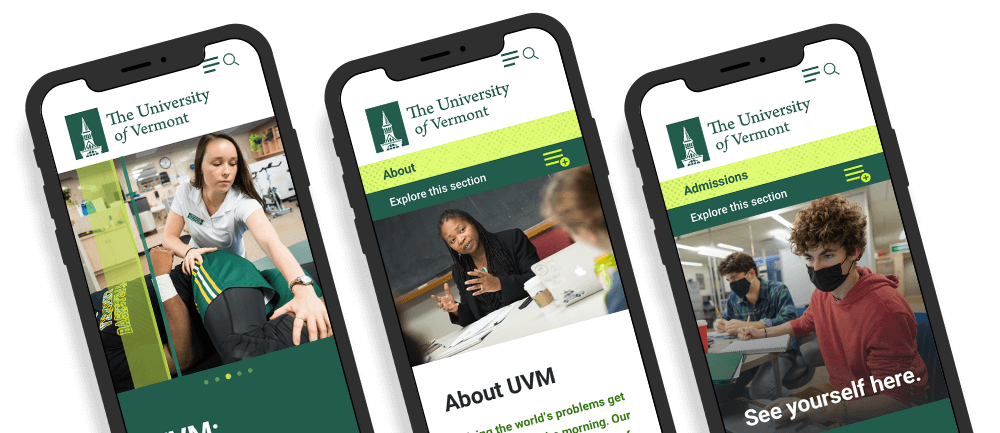
Project overview
Challenge
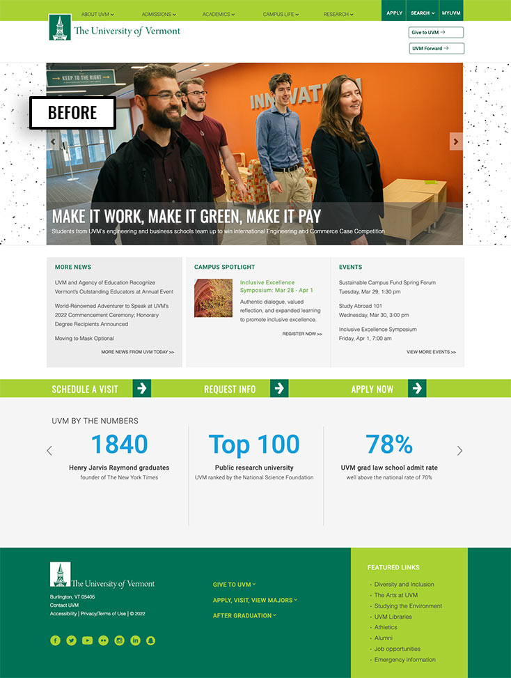
Like many large, legacy websites that have been around since Web 1.0 and gone through many redesigns and platform updates, things can get visually fragmented over time. This happens. It is definitely not a unique problem. The University of Vermont’s website is experiencing this. The design, user experience, and backend are all outdated. Their branding is well established but has not been fully extended to the website. There is a lack of brand consistency in design, tone, messaging and UX. Content creators do not have all the design patterns, components and tools they need to display content optimally. Furthermore, the structure of the site is constraining. Page grids are fixed, and design elements are not able to scale to full browser width. The navigation system is non-intuitive and the site is difficult to navigate. Many interface elements lack hover states so points of engagement with the site are not positive and clear.
SOLUTION
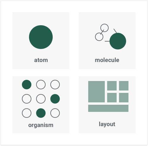
- I recommended an atomic design approach to leverage assets and unify and standardize usage of fonts, colors, surfaces, media and other design elements from a scalable component library
- Extended the brand guidelines that are so well established on the print side to the website
- Moved from an older template-based approach to a component-driven approach.
- Interpreted strategy, business and user requirements into scalable, engaging interfaces and digital products that amplified the brand
- Created a consistent and intuitive navigation system for the entire site
- Aligned brand messaging, tone and design
- Baked accessibility into components to increase overall website accessibility without dependency on content admin knowledge
- Created the Trail Mix design system in lock-step with the redesign
My Role
- UX Design
- Visual Design
- Product Design
- Design System Architect
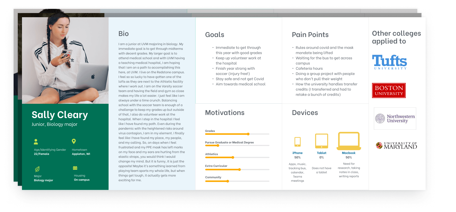
- User Personas
- Hi-fidelity Prototypes
Tools
Figma, Sketch, InVision DSM, InVision Freehand, InVision Prototyping
Status
Project pivot. New Communications leadership wanted to evolve the brand. Redesign commenced with a new brand direction. Please see the “evolving a brand with multiple design systems” for the full story.
I was tasked with extending the existing brand to the website. Here are some design elements from the UVM style guide that were referenced when doing the website redesign. The overarching style is natural, energetic and “in the moment.” Textures are used extensively. The topographic pattern, wood texture and palette embody the nature-loving culture that is a part of UVM. It is stylized but remains authentic.
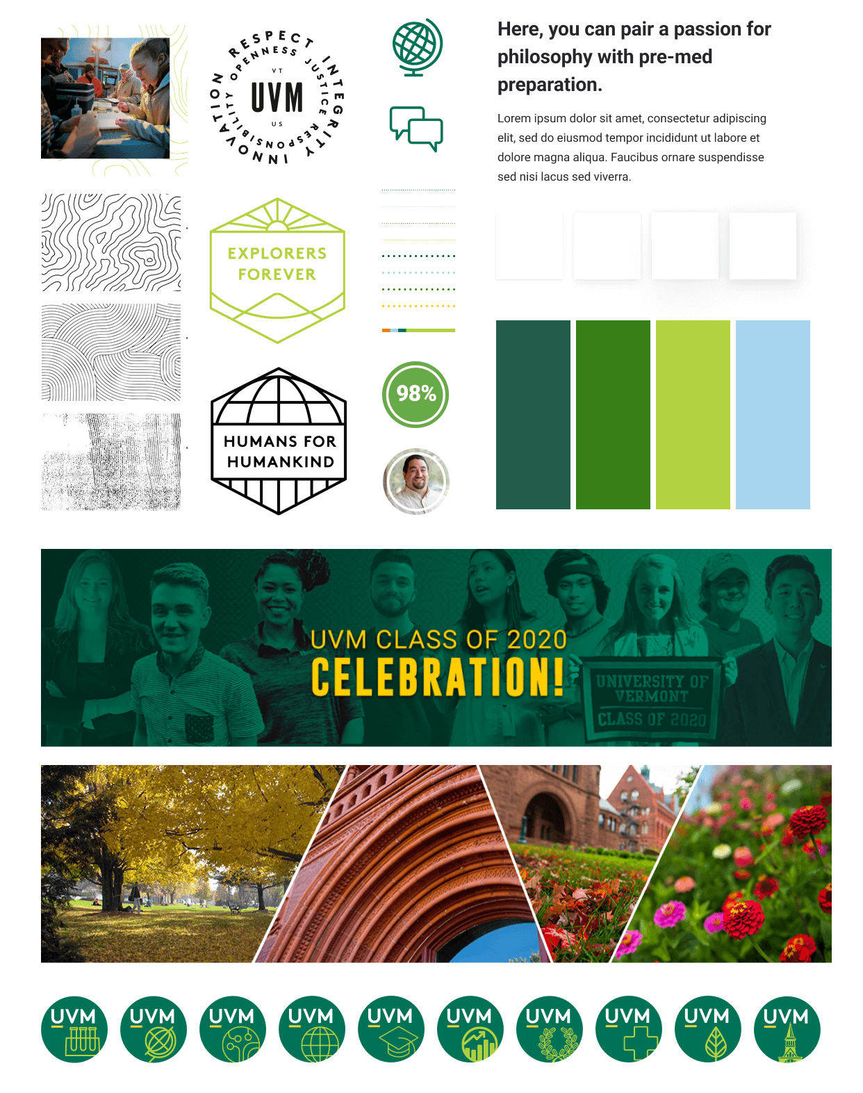
I was tasked with extending the existing brand to the website. Here are some design elements from the UVM style guide that were referenced when doing the website redesign. The overarching style is natural, energetic and “in the moment.” Textures are used extensively. The topographic pattern, wood texture and palette embody the nature-loving culture that is a part of UVM. It is stylized but remains authentic.
User personas
Evolving the brand
Brands are not static. They are nutured and cultivated and always evolving. That is true for the University of Vermont’s brand. The designs shown here are not going to be pursued as we have started taking the brand in a new direction. I am currently working on new designs that will better reflect the brand direction the University is moving towards. Scalability has informed all decisions made so the design system and all the components and assets are evolving along with the new direction. It’s exciting!
Top-tier pages were the first to get re-designed for the University of Vermont using components from the Trail Mix design system.
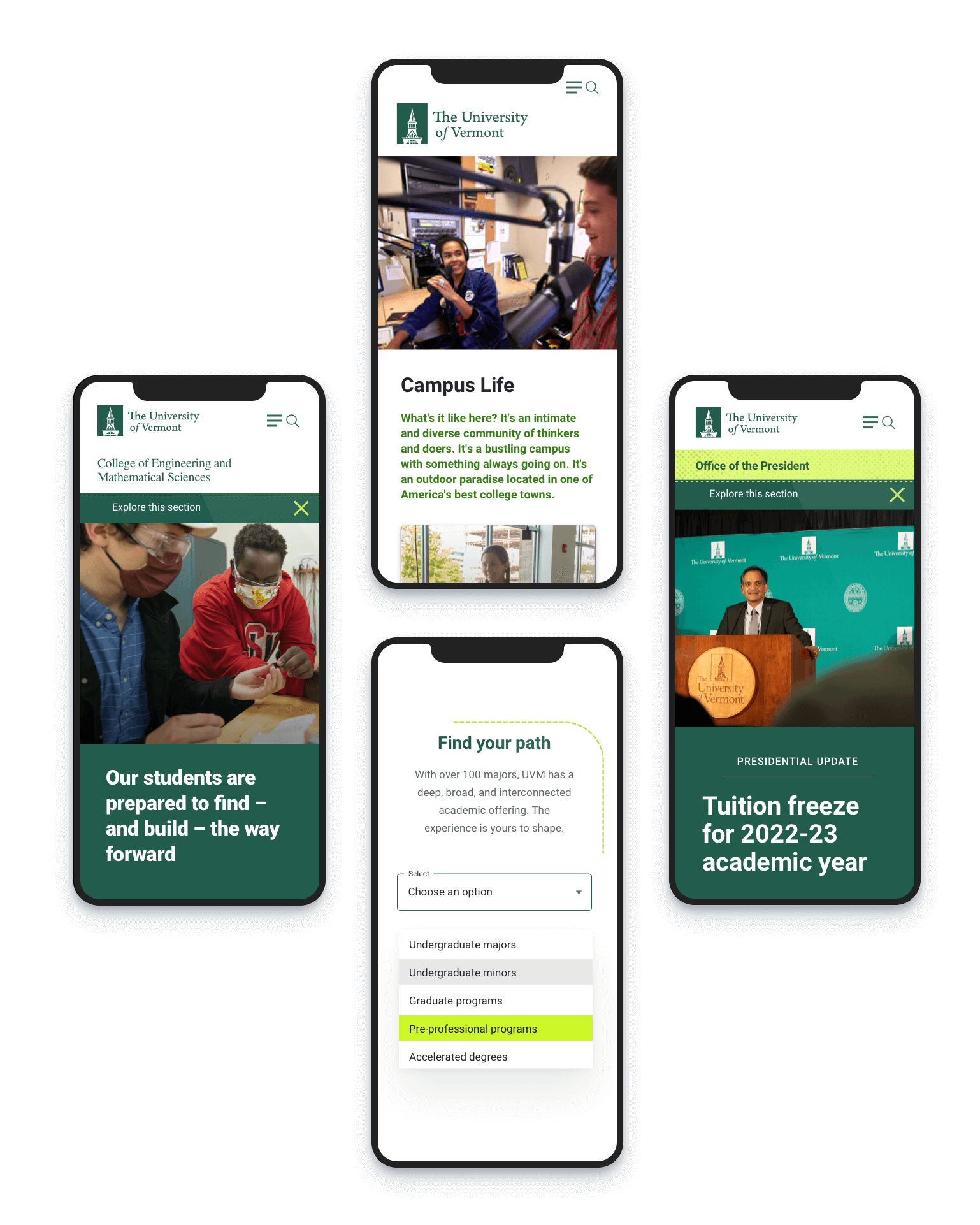
Here are some representative top-tier page layouts from a design iteration that uses the modular, atomic approach pulling components from the Trail Mix design system to create pages. It is a good example of how components can be combined in different ways to form different layouts and meet the content needs.
HOME PAGE REDESIGN
For many reasons, UVM moved away from a news-driven home page to one with flexible, modular components. News could be elevated as desired. Call to actions were added to increase engagement and provide clear entry paths for target users to follow their information scent.
This proposed home page redesign takes advantage of the new component based approach and builds upon the atomic design system we are building out.
The content strategy was to present the university’s strengths and introduce the rich academic ecosystem, vibrant community and provide clear paths into the site for our primary audiences.
I also provided a way for news to be elevated to either the hero area or a full-width component as desired, relieving the team from the demands of regularly feeding fresh news content.
The new Wayfinder component (with the “Find your path” head in the layout) provides a quick entry point for prospective students to explore the university’s academic offerings by the degree they are pursuing.
Research page design
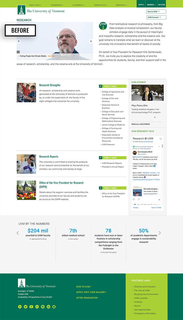
In 2022, the work of researchers has led to a Top 100 public research university ranking for UVM from the National Science Foundation. Communicating the scale and scope of UVM’s research was addressed in this proposed research page design.

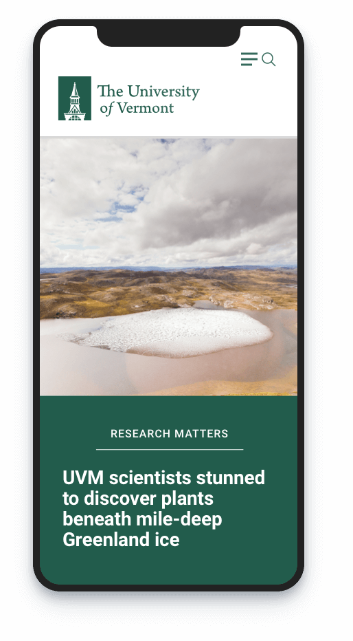
Component driven page layouts
These page layouts are component based rather than built from templates. They are flexible and can support different content strategies, messaging, business goals, user needs and actions. Like building with lego bricks, these layouts are built with elements from Trail Mix, the evolving design system that I have created for the university.
That said, there is some level of templating to provide page structure and to provide appropriate component options for the content creator by content hierarchy.
Make the naming of things scalable and related to the context, function or hierarchy
Embracing change has been key to decisions made throughout the process. For example, I re-worked the brand palette for digital to comply to WCAG AA standards. At the same time, the palette names have changed to be scalable and not related to their visual properties, which are bound to change over time.
“UVM Green”, for example, has become “primary1”. That way if the palette evolves, we don’t end up confusing and contextually irrelevant CSS styles. The same approach has been applied to the naming of all styles, atoms, molecules, and components.
Academic Program Finder
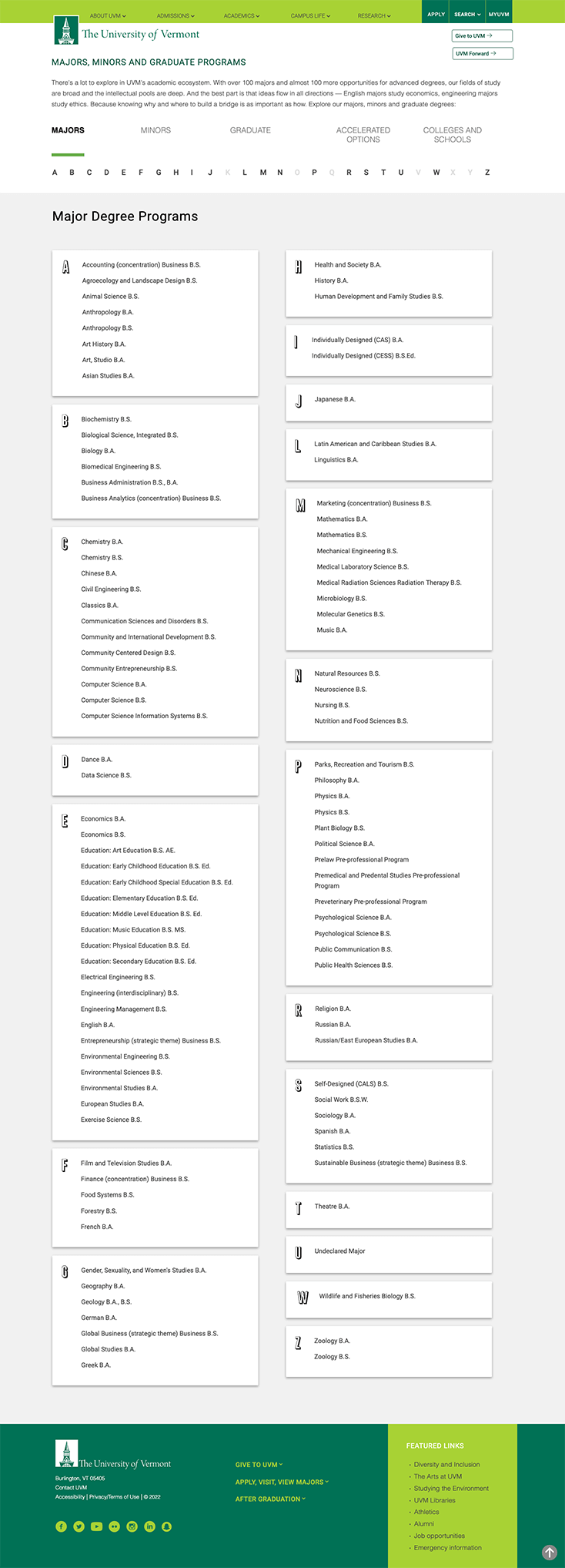
This high-traffic page informs site visitors what academic programs are offered. The goal is to provide an intuitive interface to allow prospective students to discover the depth and breath of UVM’s academic offerings.
Historically, this page is a sortable list of programs grouped on alphabetical cards. The interface was straightforward and provided a jumping off point to the academic programs.
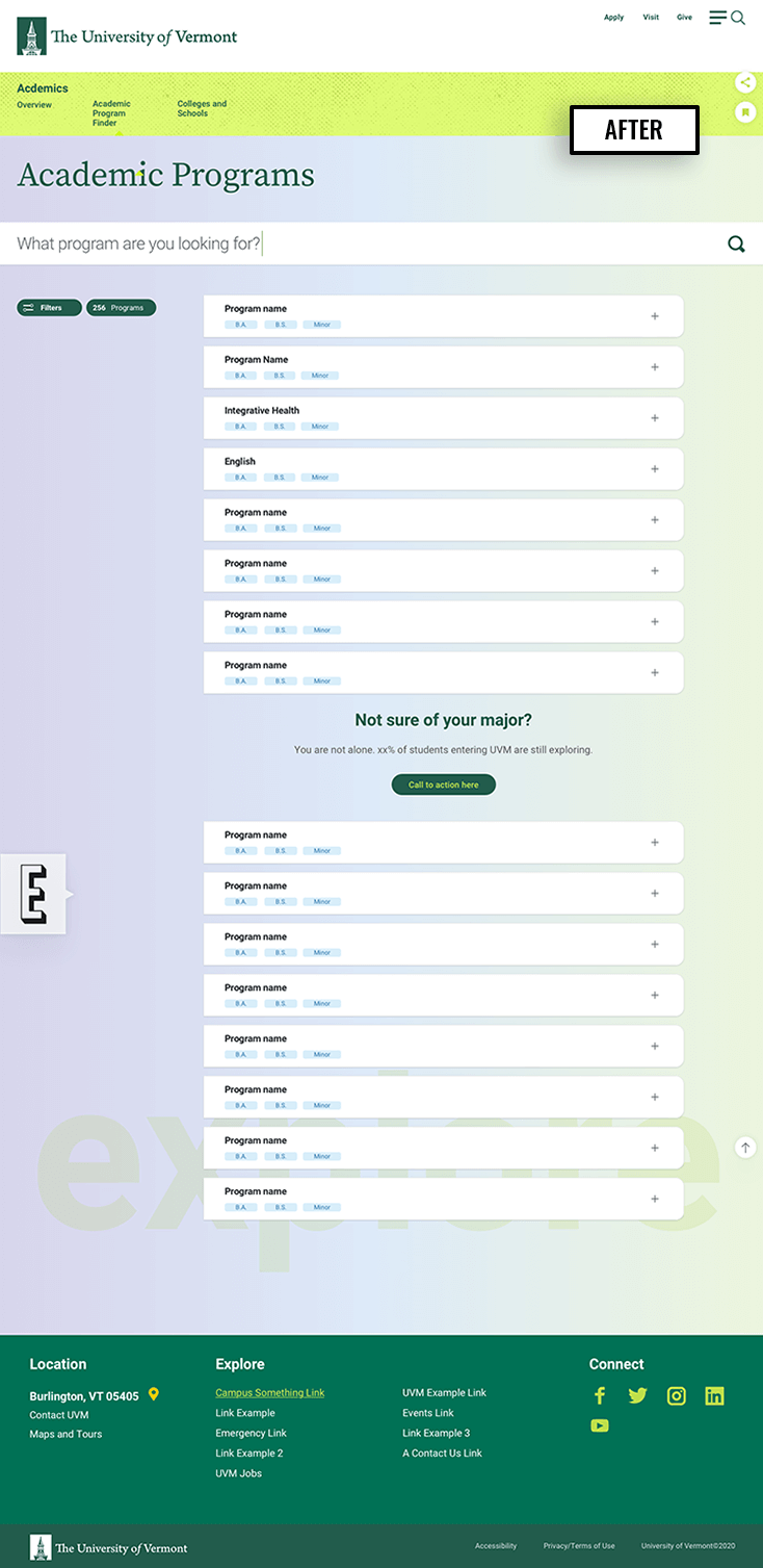
This design approach functions as a more robust program finder and comparison application.
The content is filterable and sortable and provides both a quick high-level view and comparison view.
The user has more pertinent and consummable information in one location to quickly glean what’s needed and then only diving deeper into the site after verifying interest.
Furthermore, comparison views can be shared so the prospective student or their family can re-enter where they left off.
DESIGN SYSTEMS + atomic design
Working with a design system
Take a look at the Trail Mix design system that I created for the University of Vermont to view the foundation of these layouts and UVM’s evolving component library.
You may also like
Component-driven marketing landing page
Marketing landing page design to raise product awareness for B-Corporation Seventh Generation.
Search interface design
UX and visual design for the primary search interface on a higher education website.
