
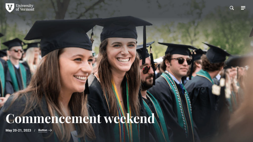
Redesign with enterprise-level brand consistency
400+ websites, 1,000 content editors, one brand

Project overview
Challenge
How do you roll-out a redesign across 400+ websites managed by over 1,000 website editors and achieve brand consistency?
SOLUTION
I leaned into the design system I developed for the University to effectively tackle the challenge of maintaining a cohesive brand experience at scale.
- Designed a comprehensive library of scalable components and a versatile UI kit to meet a wide range of communication and display needs across various audiences and applications.
- Rigorously tested components and layout combinations using edge cases to ensure they seamlessly integrate into diverse contexts and scenarios.
- Provided user guidelines, implementation and layout examples, tooltips, do’s and don’ts, along with training and support for content administrators.
- Implemented “guardrails” within the component build to maintain display integrity, even when content administrators upload content with incorrect specifications, such as the wrong aspect ratio on images.
- Baked accessibility into components reducing the dependency on content administrators’ expertise.
- Created a library of WYSIWYG styles to supplement the component library to ensure that text-heavy layouts are accessible and delivery a cohesive brand experience.
My Role
- UX Design
- Visual Design
- Product Design
- Design System Architect
- Hi-fidelity Prototypes
Tools
Figma, InVision DSM
Status
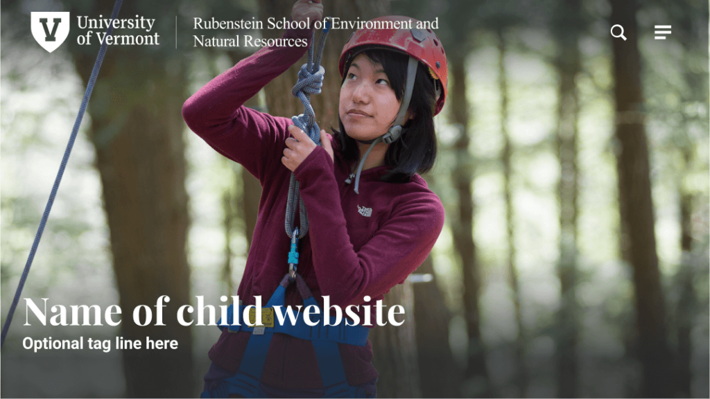
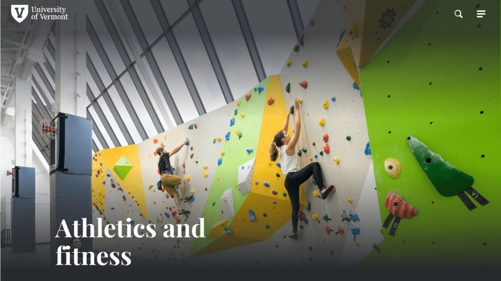
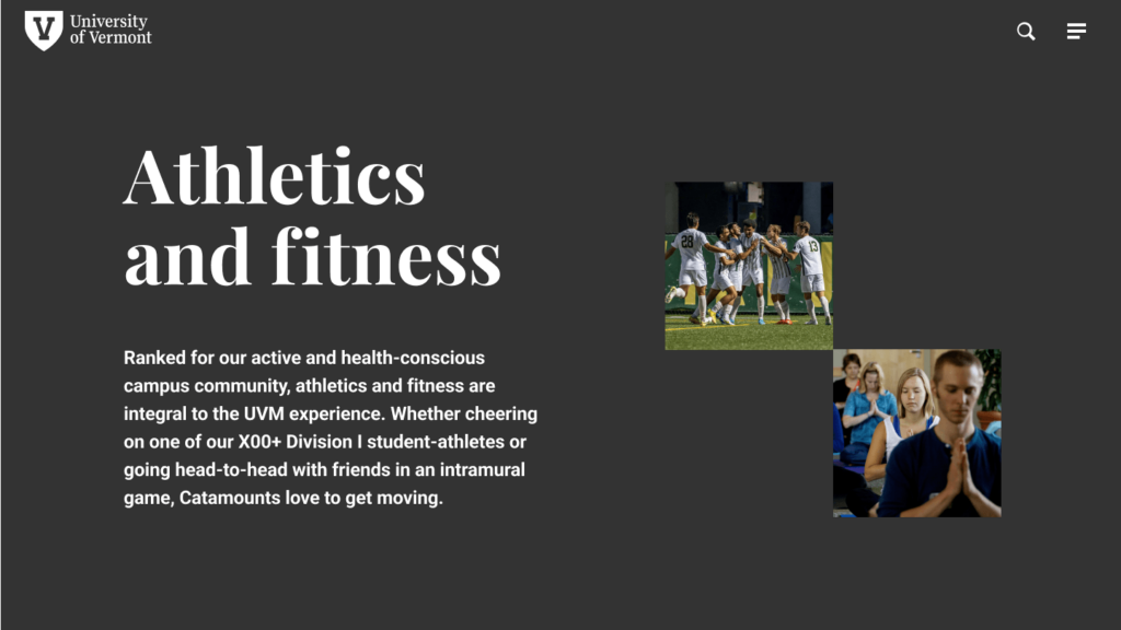
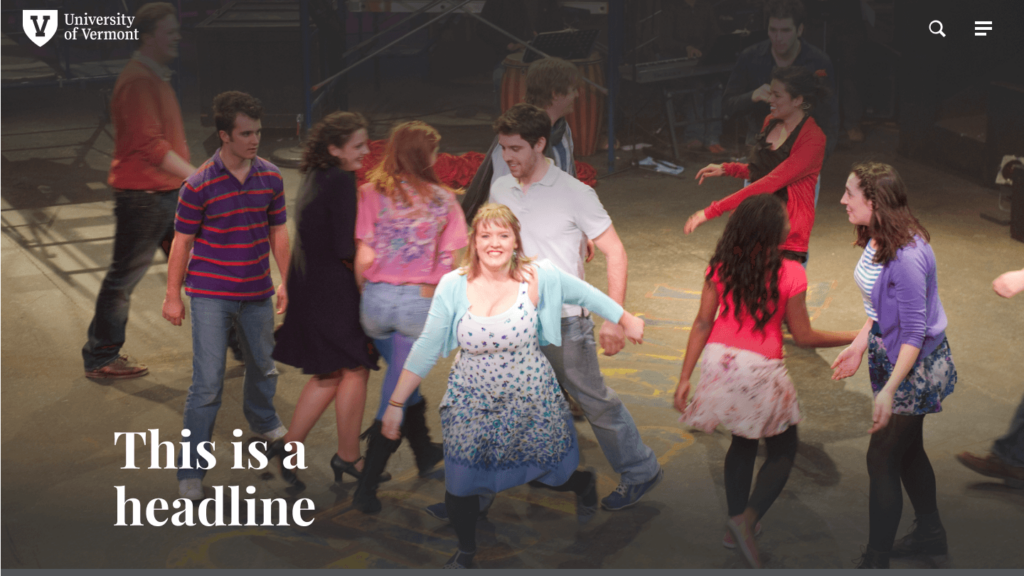
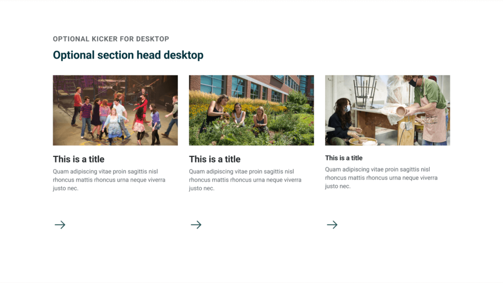
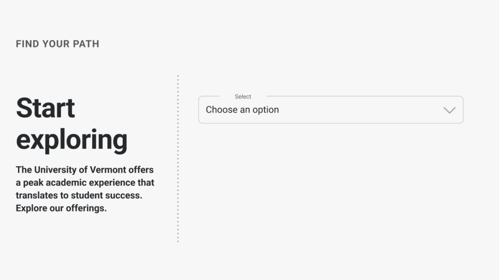
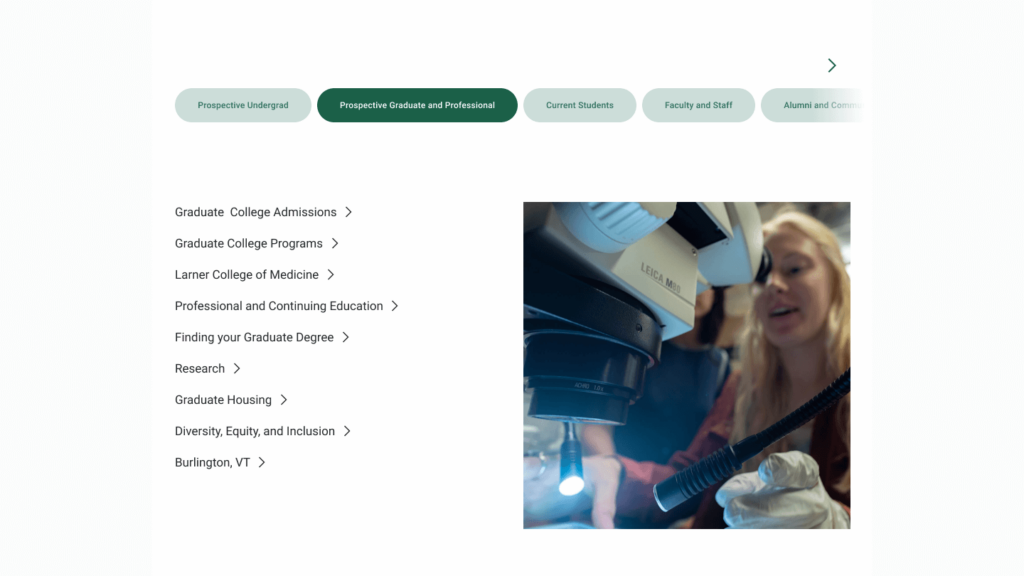
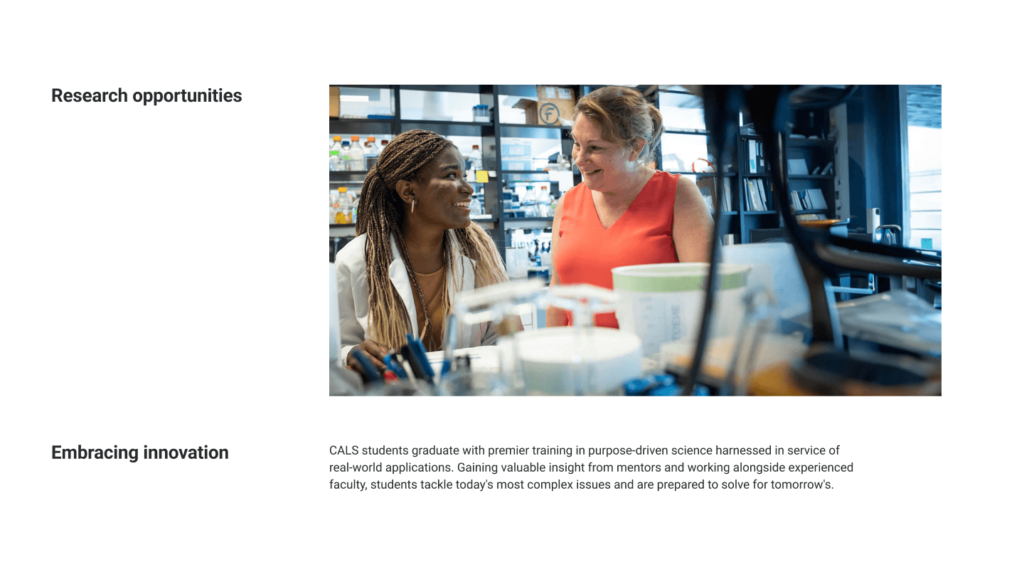
A scalable component library is the foundation of the redesign
I designed a comprehensive library of scalable components and a versatile UI kit to meet a wide range of communication and display needs across various audiences and applications. Here are some examples.
-
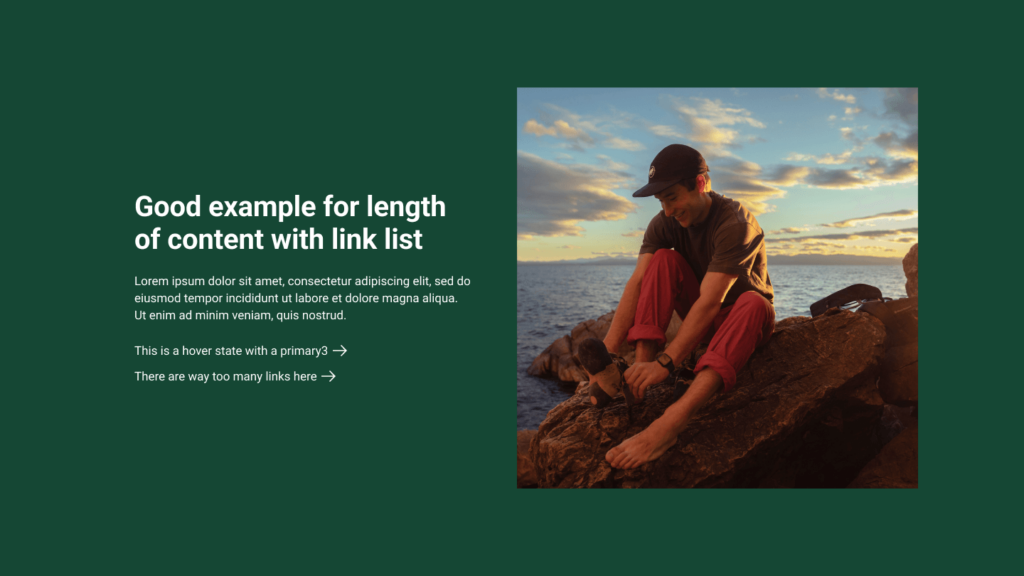
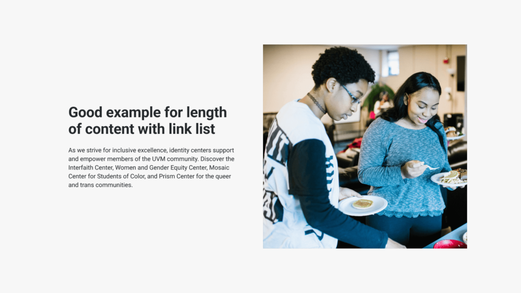
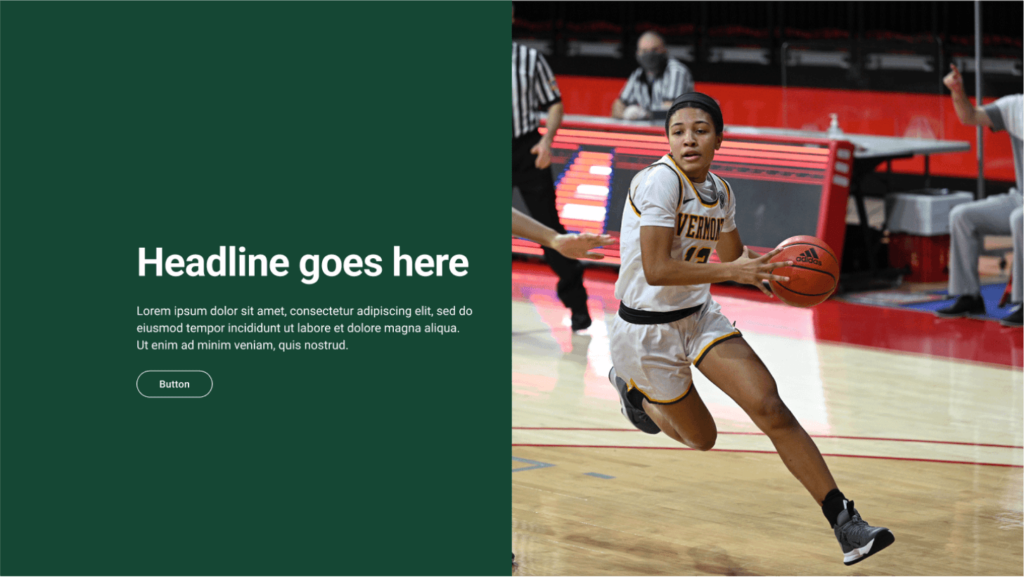
5050 Basic
-
5050, Image lockup
-
5050 Basic
-
5050 Big
-
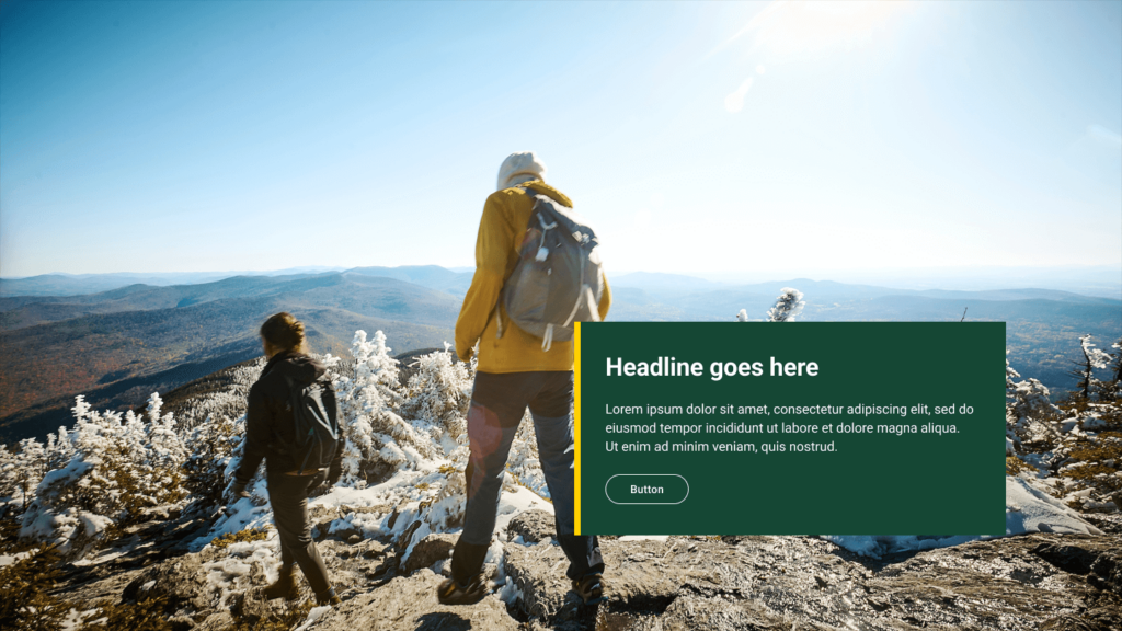
Banner with Overlay
-
Short hero, text only
-
Short hero, single image
-
Short hero, image group
-
Short hero, cover image
-
Hero story scroll
-
Story scroll, parallax overlay
-
Basic hero
-
Takeover hero
-
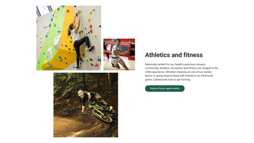
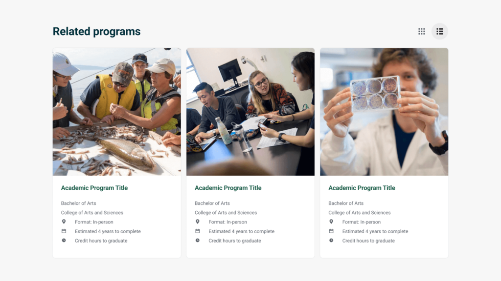
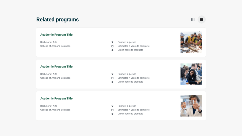
Tile Group
-
Media Card Group
-
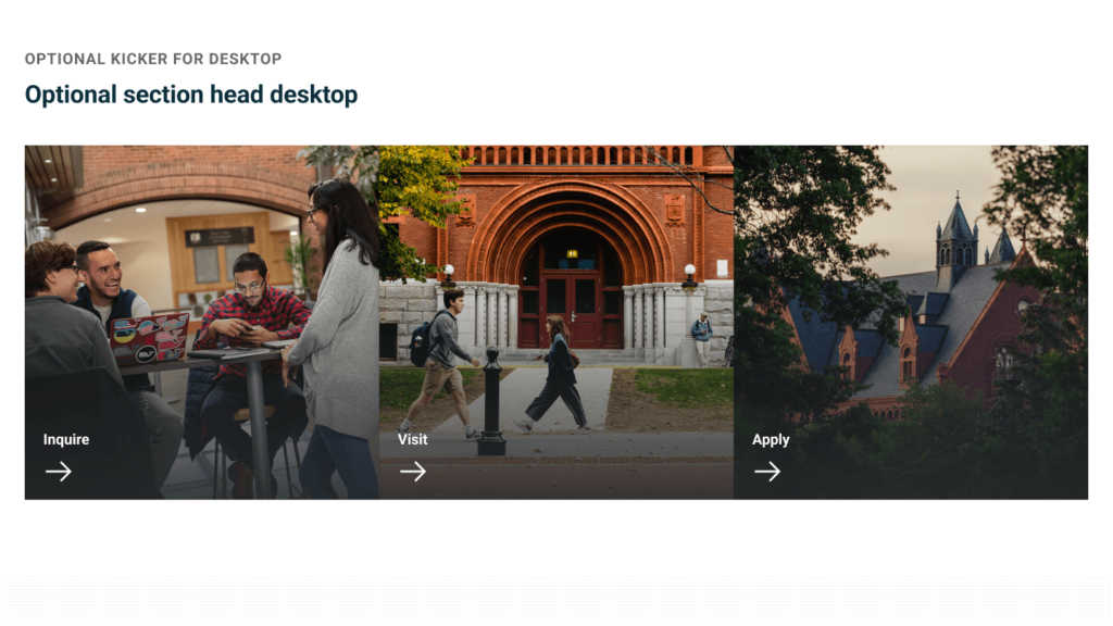
Image Teaser
-
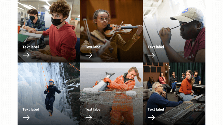
Image Teaser Stacked
-
Wayfinder
-
Quick Guide
-
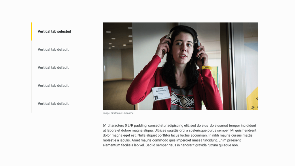
Vertical Tabs
-
Info Bands
-
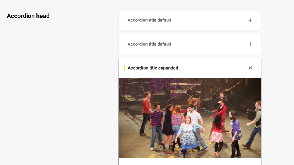
Accordion
-
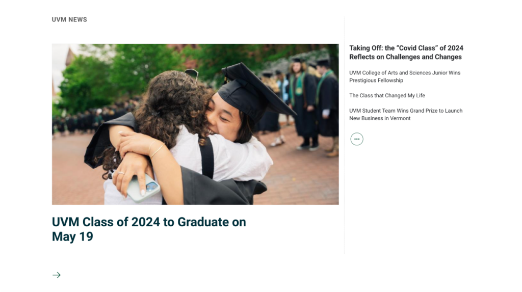
Featured News, List
-
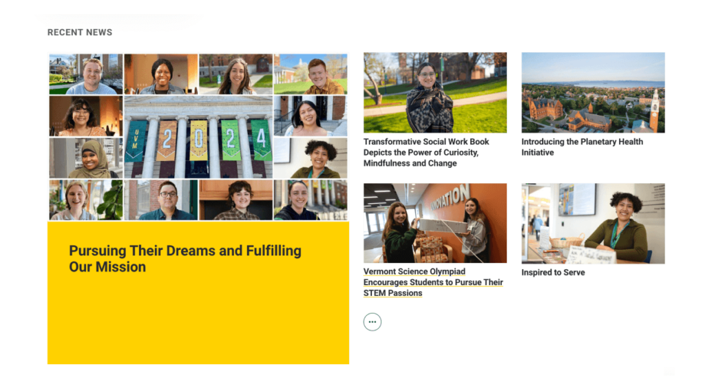
Featured News, Cards
-
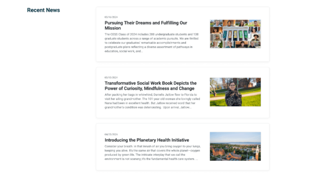
News List
-
Profile Teaser Cards
-
Profile Teaser List
-
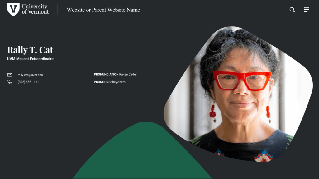
Profile hero
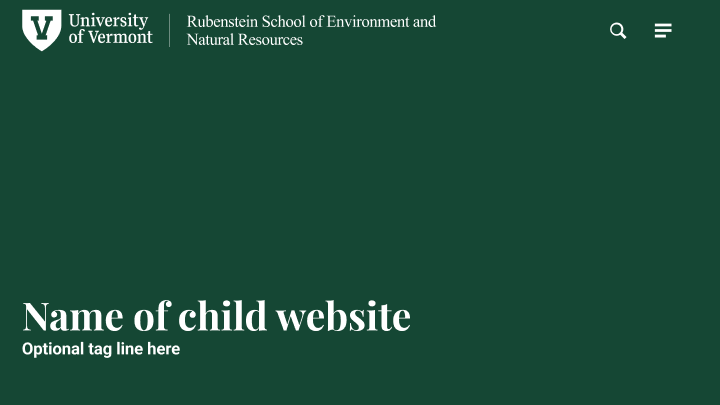
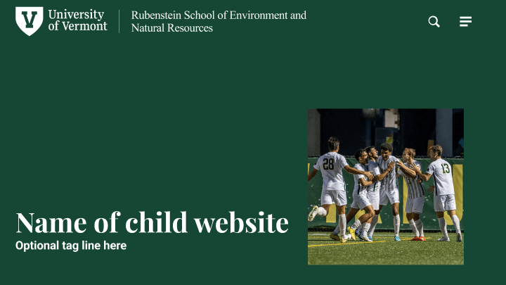
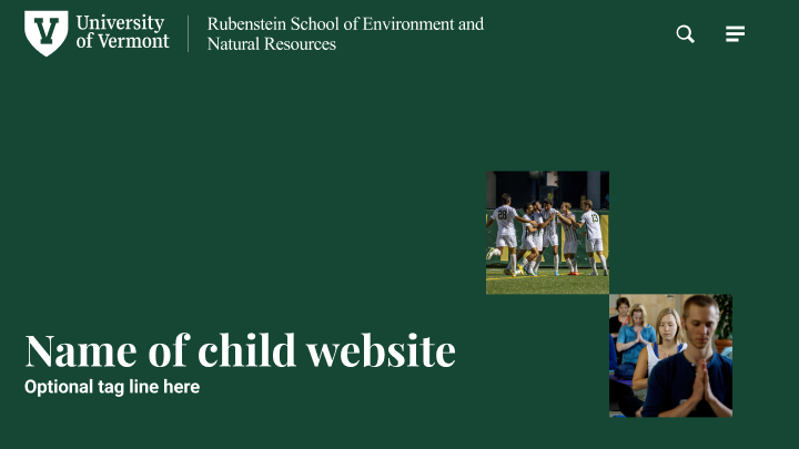
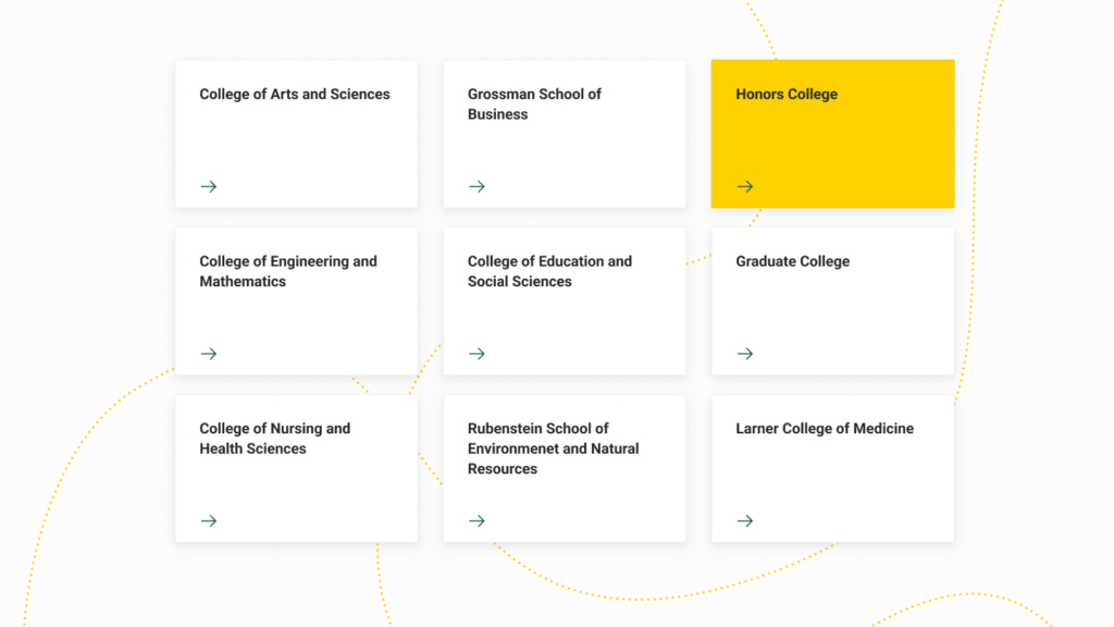
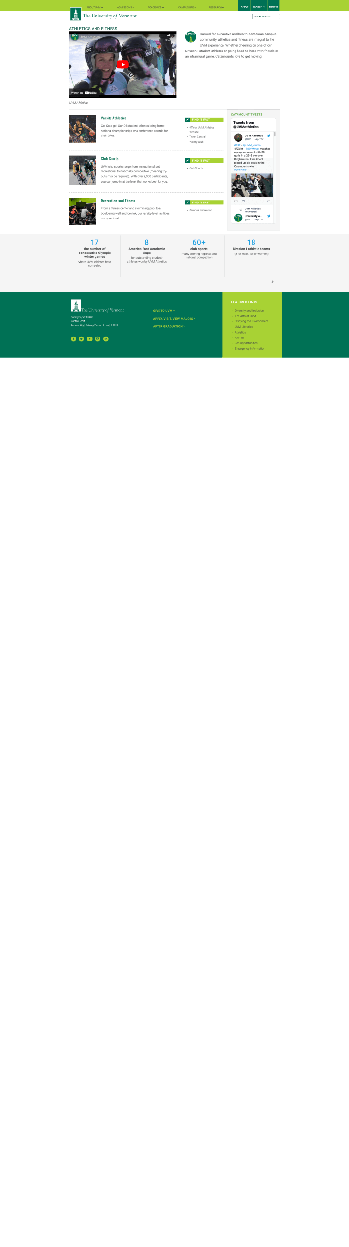
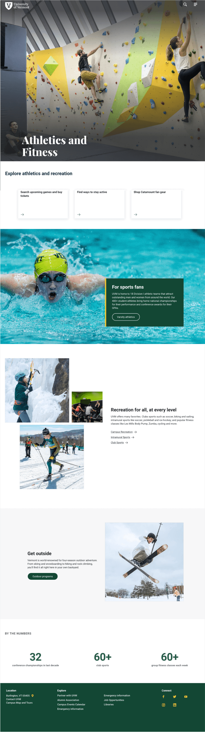
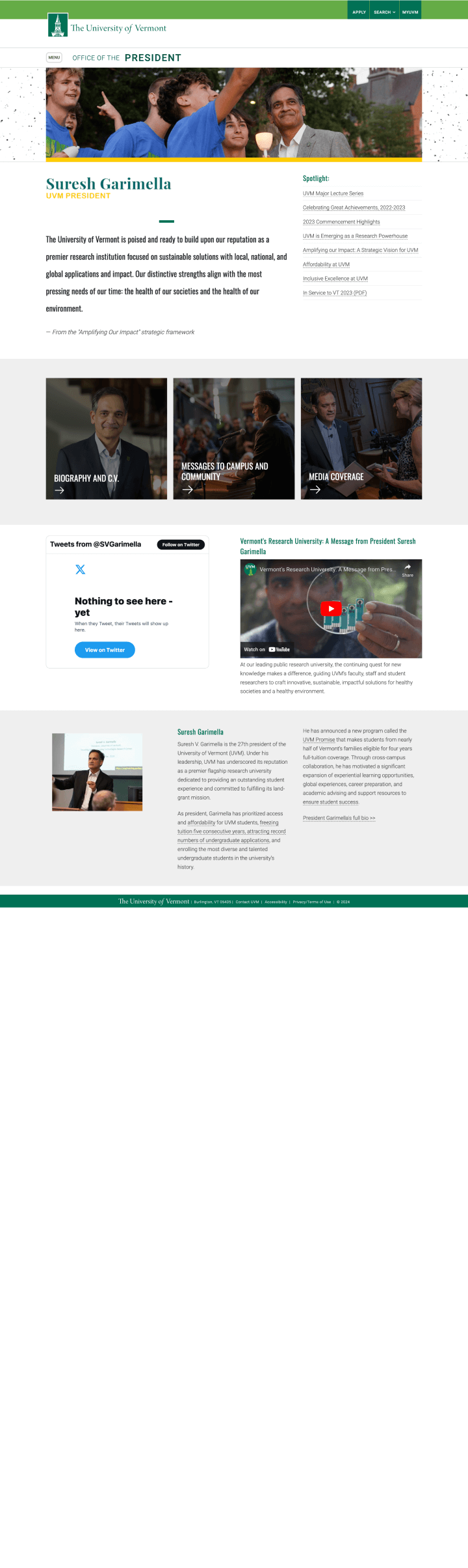
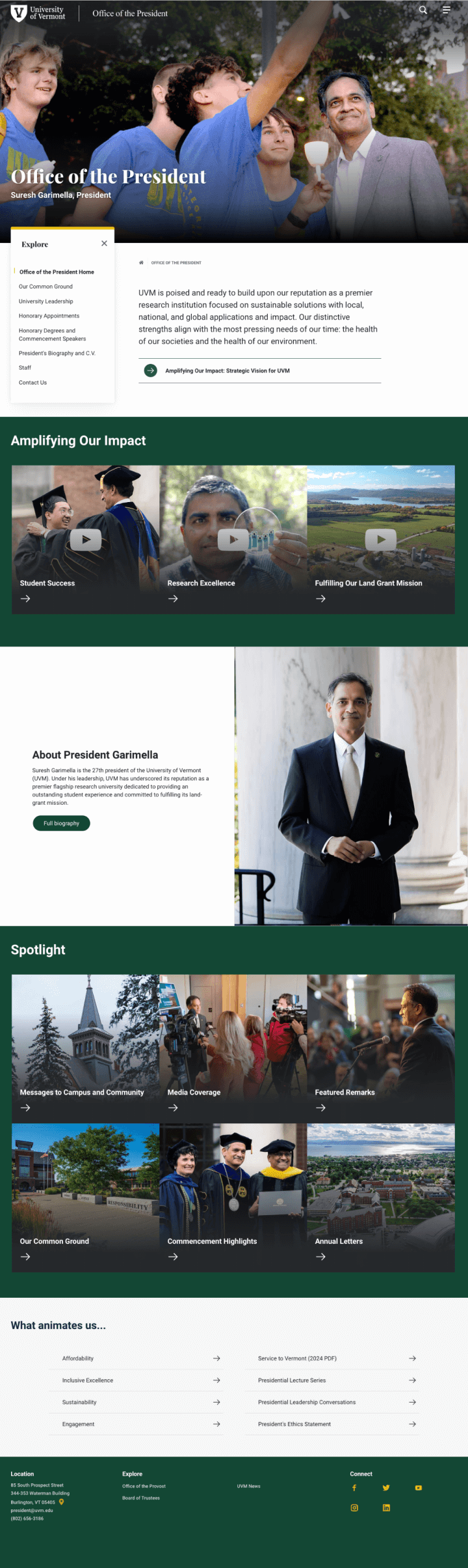
Cohesive brand experience and compelling layouts at scale
Website editors at the University are getting introduced to the visual language, components and UI elements that make up their design kit in Drupal. It’s exciting to see the components I designed in the wild getting crafted into layouts, pages, and websites.
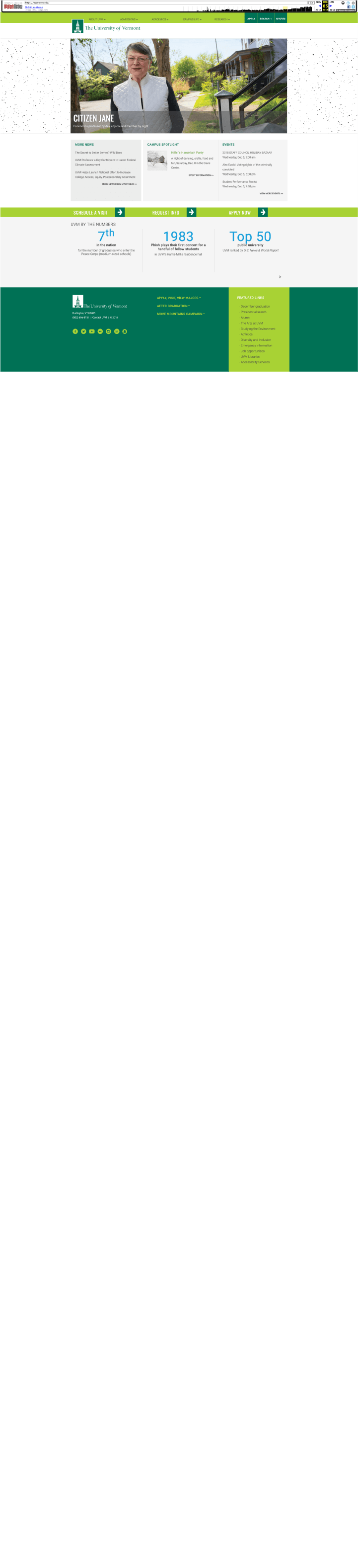
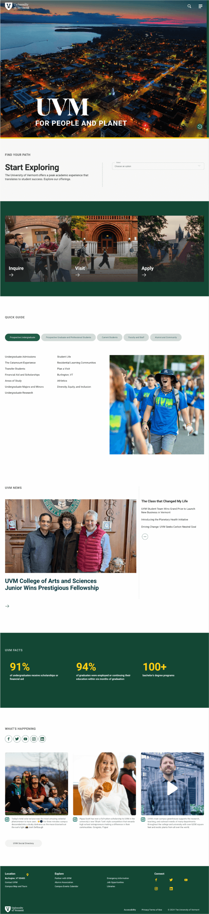
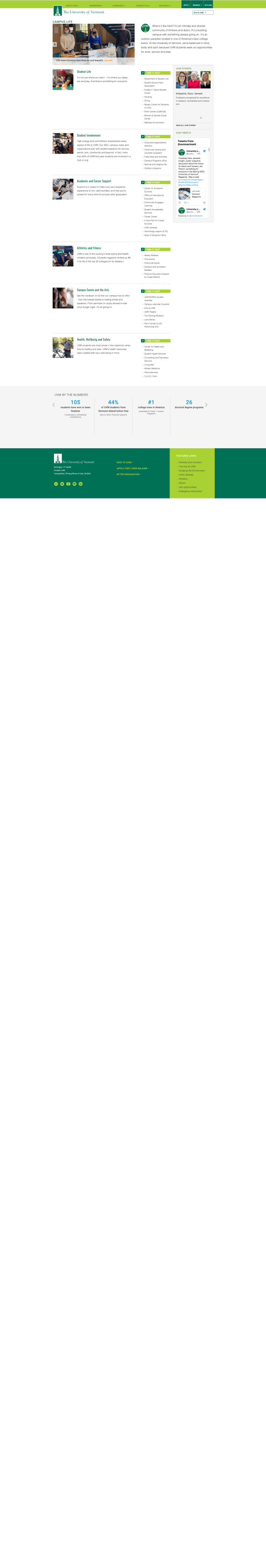
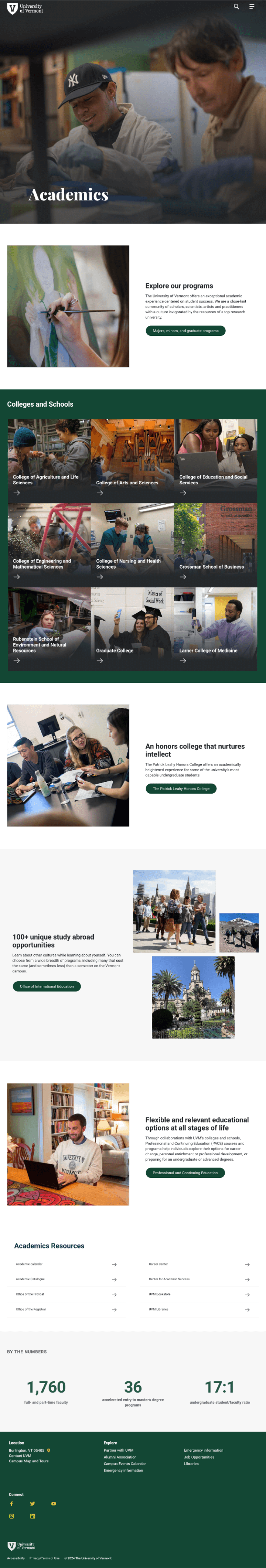
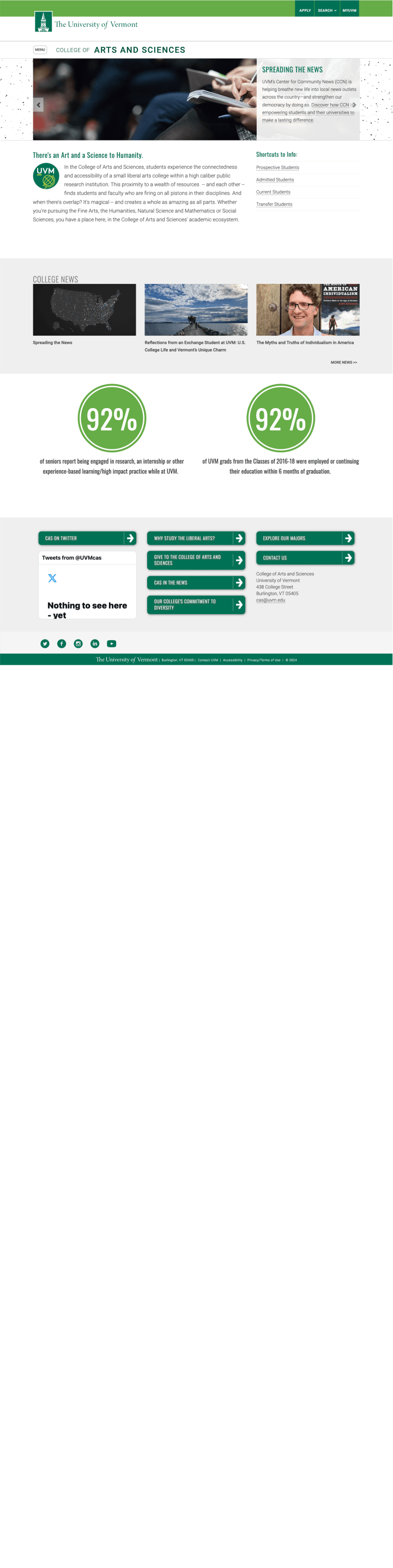
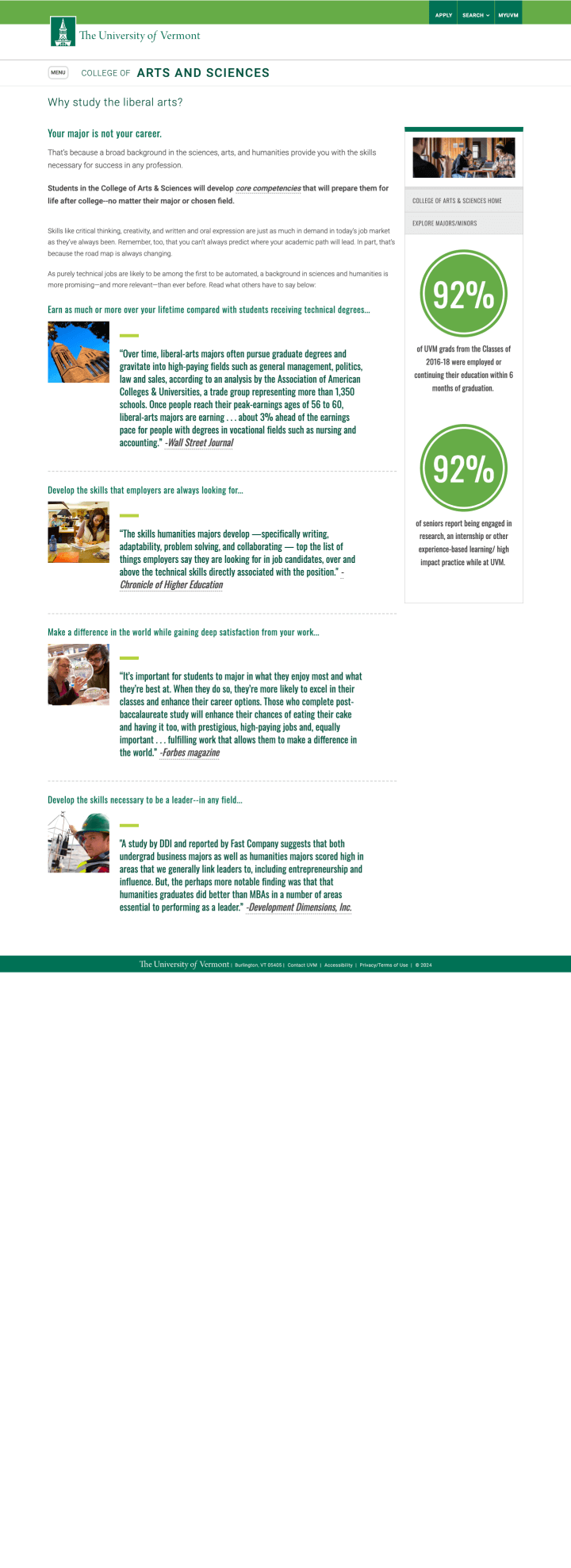
Here are the links to websites that UVM producers have made with the new design
Revamping a website entirely on a new platform is a big lift. However, it has provided an opportunity for conducting site audits, analyzing analytics to identify engaging content, and reconsidering the information structure. The resulting websites boast improved navigation, purposeful content, thoughtful design, user-centric features, and alignment with our brand. Special thanks to the digital team for developing the component library, training staff, and to the university’s web producers for meeting the challenge of launching these websites.
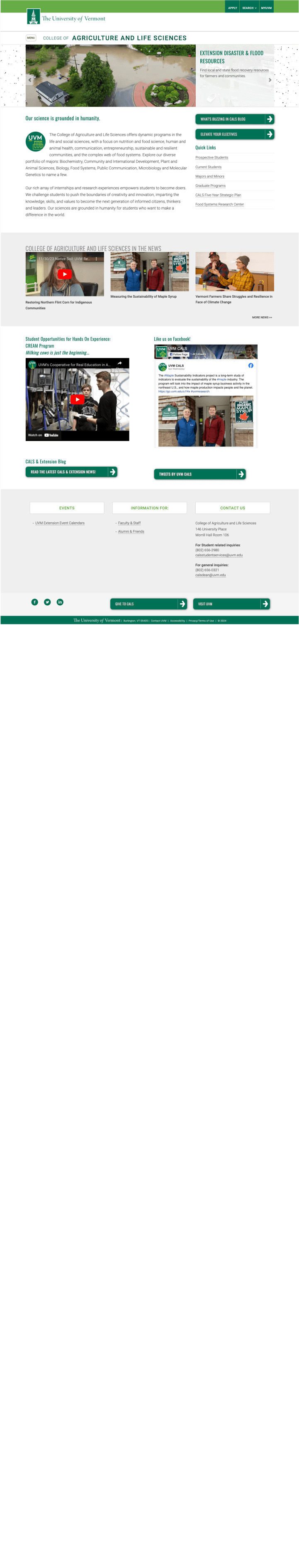
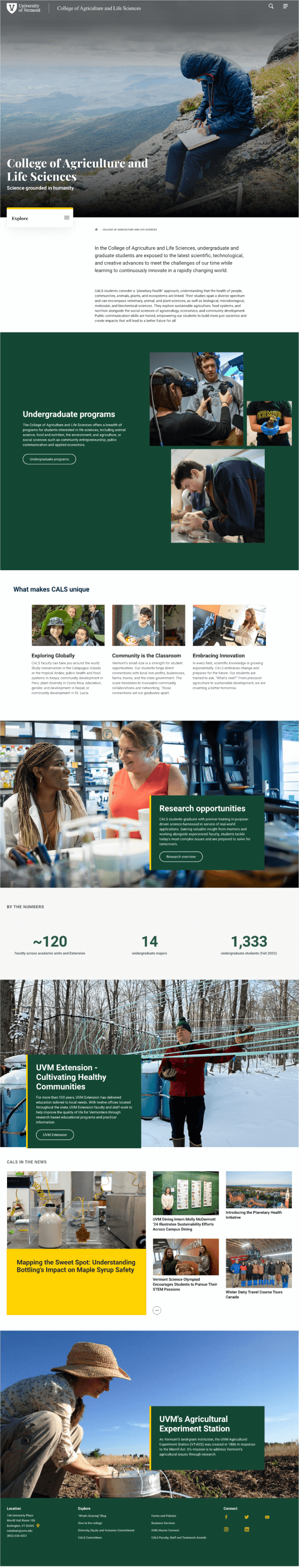
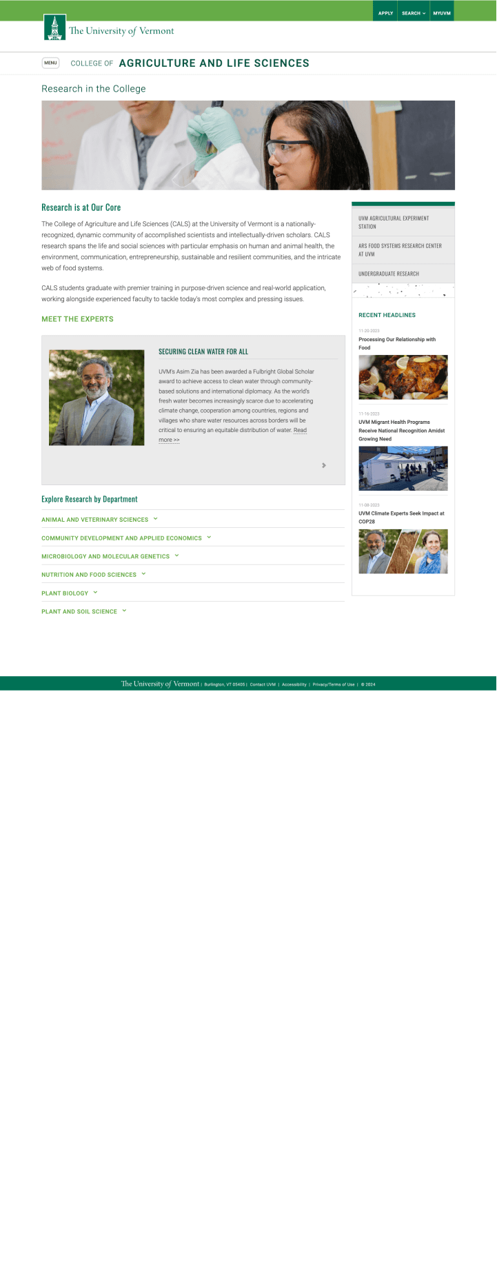
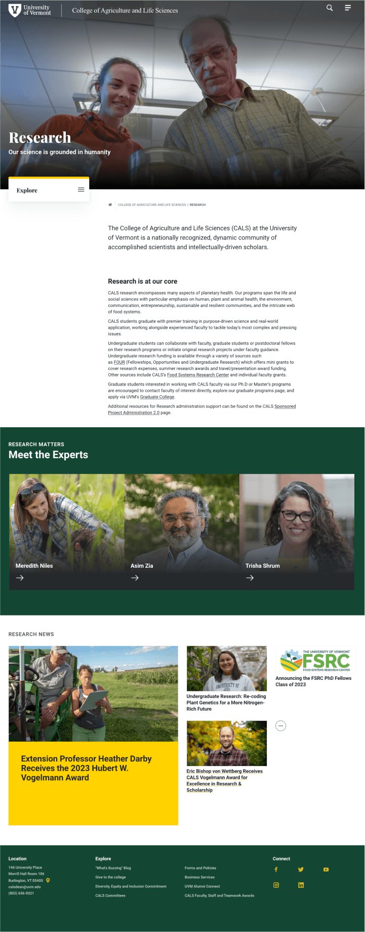
SCHOOL AND COLLEGE WEBSITES
College of Arts and Sciences >
College of Agriculture and Life Sciences >
College of Education and Social Sciences >
College of Engineering and Mathematical Sciences >
College of Nursing and Health Sciences >
Larner College of Medicine, Clinical and Translational Science >
ACADEMIC DEPARTMENT WEBSITES
Biology >
Department of Environmental Studies >
Department of Psychological Science >
Division of Enrollment Management >
TOP-TIER PAGES
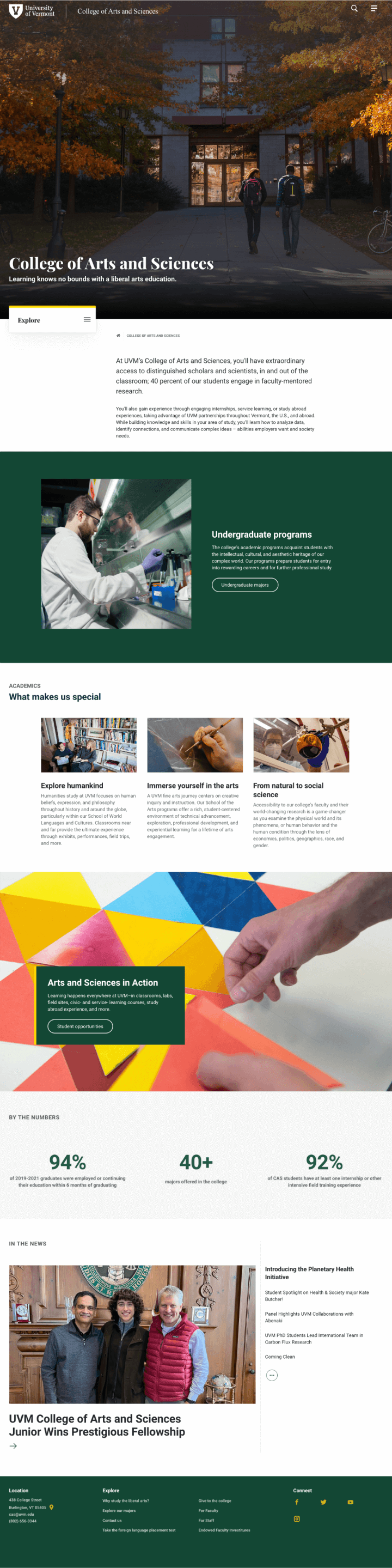
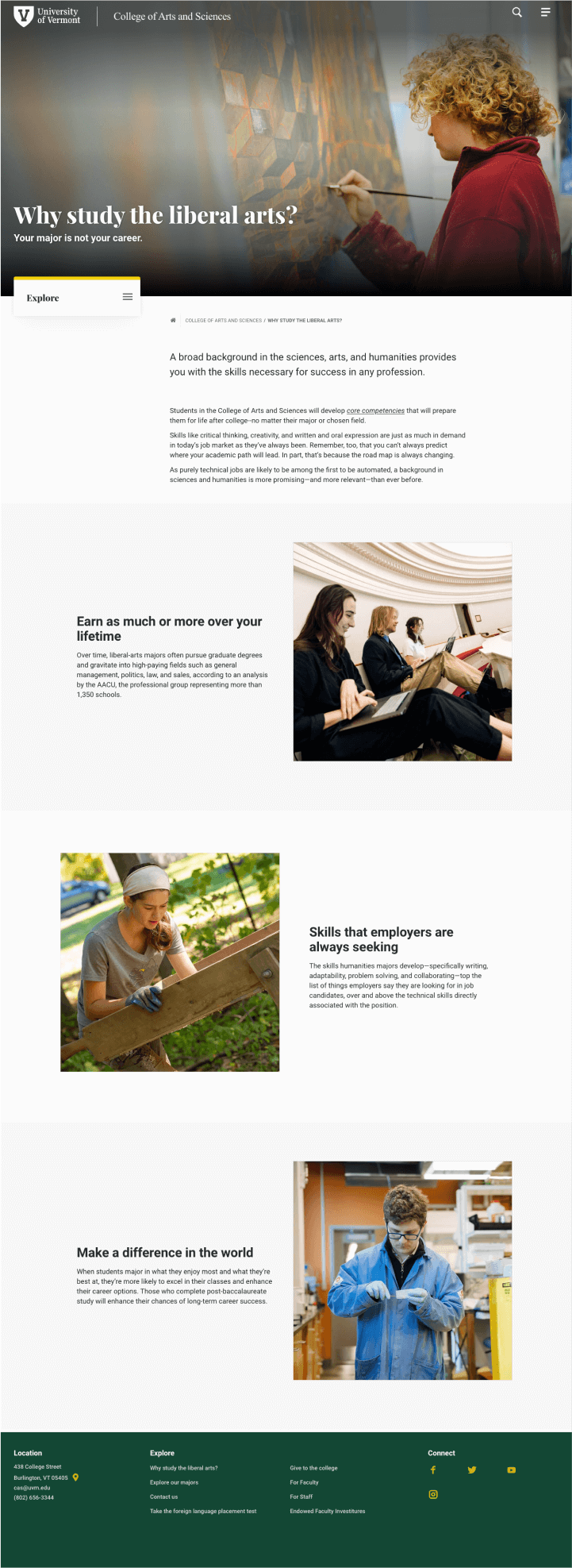
View the evolution: before and after website designs
Who doesn’t love before and afters? Simply slide through each webpage thumbnail to compare the old design I inherited with its redesigned counterpart, assembled by web producers using the innovative component library I designed. Explore the transformation from legacy to modern with these sample pages.
Provide support so website editors can create successful layouts, pages, and websites

One of the things I was concerned about when it came time to release the component library and Drupal 10 website editing environment to the website administrators and content editors was how to help them work with the component library and create successful layouts, pages, and websites.
Although I am surprised sometimes by the things people try to do with the system, my fears have not come true. Here are some of the ways content editors are supported by me and the digital team to create cohesive, on-brand websites.

01
Give content editors fail-safe display choices
A library of user-centric, hard working components does not guarantee compelling layouts and websites.
I rigorously tested components, WYSIWYG content styling, and layout combinations in prototypes and user flows using scenarios and edge cases to ensure they combined well to make a cohesive brand experience
This rigorous testing gave content editors the freedom to create with better outcomes.
02
Accelerate page creation and creative options
Deciding which component to use to provide an optimal user experience can be a trial process.
To help content editors pick the best display for their content, I created progressive design collections that give content editors with a range of display choices. Once the content has been uploaded into Drupal, editors can view display options via a drop down selection.
This accelerates layout and page creation, allows content editors make optimal choices for the display of their content, and creates a better user experience.

- WCAG contrast compliant
- Keyboard accessible
- Screen reader compatible
- Responsive, mobile first
- Focus styles
- Semantic HTML hierarchy
03
Bake accessibility into the design
As a public institution, the University of Vermont values diversity and aims to foster an inclusive, accessible website experience for all. As a product designer, I whole heartedly embrace accessibility, integrating guidelines into every stage of my design process.
Incorporating accessibility into components lessens the reliance on content editors’ expertise. At the University, content editors add their own <alt> tags to photos, and training is provided on best practices.
04
Keep it simple and build in guardrails so the display cannot break
Keep it simple and build in guardrails so the display cannot break
For the 1,000+ individuals granted website admin privileges, managing the website is just a small part of their job duties. Most lack basic asset preparation skills, with many unable to perform simple tasks like cropping images to specific aspect ratios.
I kept things simple by utilizing only two image aspect ratios on the website: 16×9 and 1×1. Additionally, we built in guardrails so the display doesn’t break if an incorrectly sized image is uploaded into the CMS- something that happens more often than not!


05
Provide multiple types of support
Because everyone learns differently and people are squeezed for time, we provided mulitple types of support including user guidelines, implementation and layout examples, tooltips, component thumbnails within the Drupal admin, do’s and don’ts, along with weekly, online training and support help hours.
06
Be prescriptive when it enhances the user experience
We decided to standardize layouts for academic program pages across the University’s 7 schools and colleges to provide a consistent user/customer experience and and to facilitate program comparison. This consistency helps convey a sense of unity across the institution, lays the data foundation for future Academic Program Finder functionality, streamlines content management, and expedites the process of launching these pages.

You may also like

Component-driven marketing landing page
Marketing landing page design to raise product awareness for B-Corporation Seventh Generation.

Perfecting the split content block
Variations on this hard-working, ubiquitous design product.

Search interface design
UX and visual design for the primary search interface on a higher education website.

Product locator application
UX, UI, and visual design for a product locator application for B-corp Seventh Generation.

Copyright Website 2024 | Site Map | Credits