Admissions Portal for prospective students
The University of Vermont
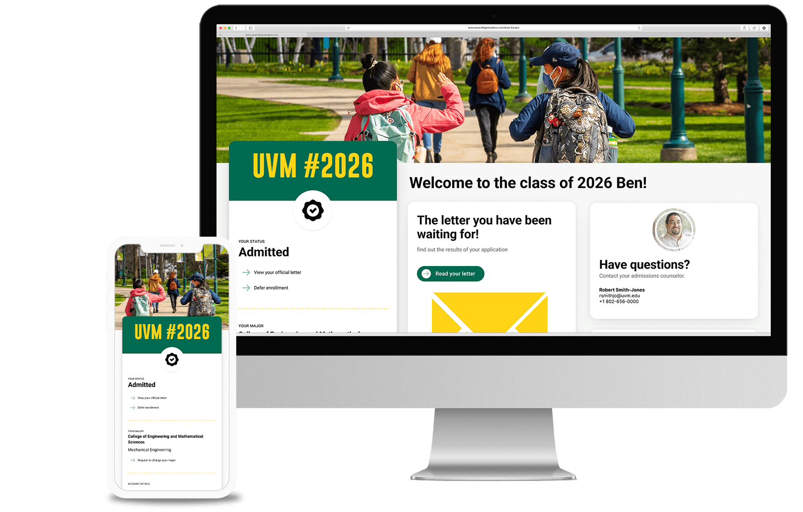
Project overview
Challenge
The Admissions Portal is a critical brand touch point for prospective students during their application journey with the University since all of Admissions communications with the student happens in the portal. The UX and design of the portal was clunky and not user-centric. It lacked interface clarity. It was hard to tell what was clickable and what was not. The level of support needed was considerable.
GOALS
The driving force of the new content strategy and design was to make this page student centric and easy to digest at a glance. Primarily, users go to this page for two reasons:
- to know the status of their application
- and find out what their next steps are
Audience
Prospective students
Scope and Constraints
- There were some guardrails that we bumped up against when working with the Slate platform including content organization, grid and breakpoints, styling, data population and personalization.
My Role
- UX Design
- Product Design
- User Journey Mapping
- Design System
Tools
Figma (wireframe and prototyping)
Link
The Portal went live and was well received. It is not public facing as it holds sensitive student data.
Issues with portal before the redesign
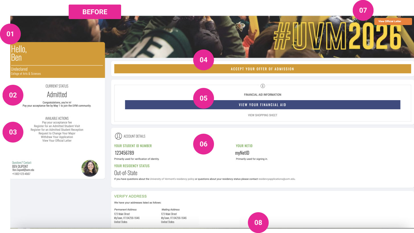
01 Color coding
The 13 difference statuses had a color coding that did not translate any useful meaning to the user- or to the team, for that matter.
- Color had no significance or meaning tied to status
- Use of color coding went against the “don’t make me think” rule
- Color on its own to indicate status is not accessible
02 Status and primary CTA are bundled
- Primary Call to Action not recognized as a link
- Urgent To Do right after congratulations feels bad (Congratulations! Now pay us)
03 Available Actions list
- Not recognizable as links – styling has no underline, icons or change of color
- “Precious” centered-diamond setting looks more like a copyright notice for a novel
04 Unregonizable buttons
- These full-band heads are, believe it or not, actually buttons that have scaled to fill their container. They are not identifiable as interface elements.
05 Financial Aid Call to Action
- Button not identifiable as a UI element
- This is a primary CTA that is not clear.
06 Account details too prominent
07 Button label misleading
- No confidence in the click. What Critical Letter?
- If it is critical, why is it blending into the upper right corner?
08 Awkward container width on desktop
- 2/3rd width content container creates awkward content layouts and line lengths
Solution: working with a design system
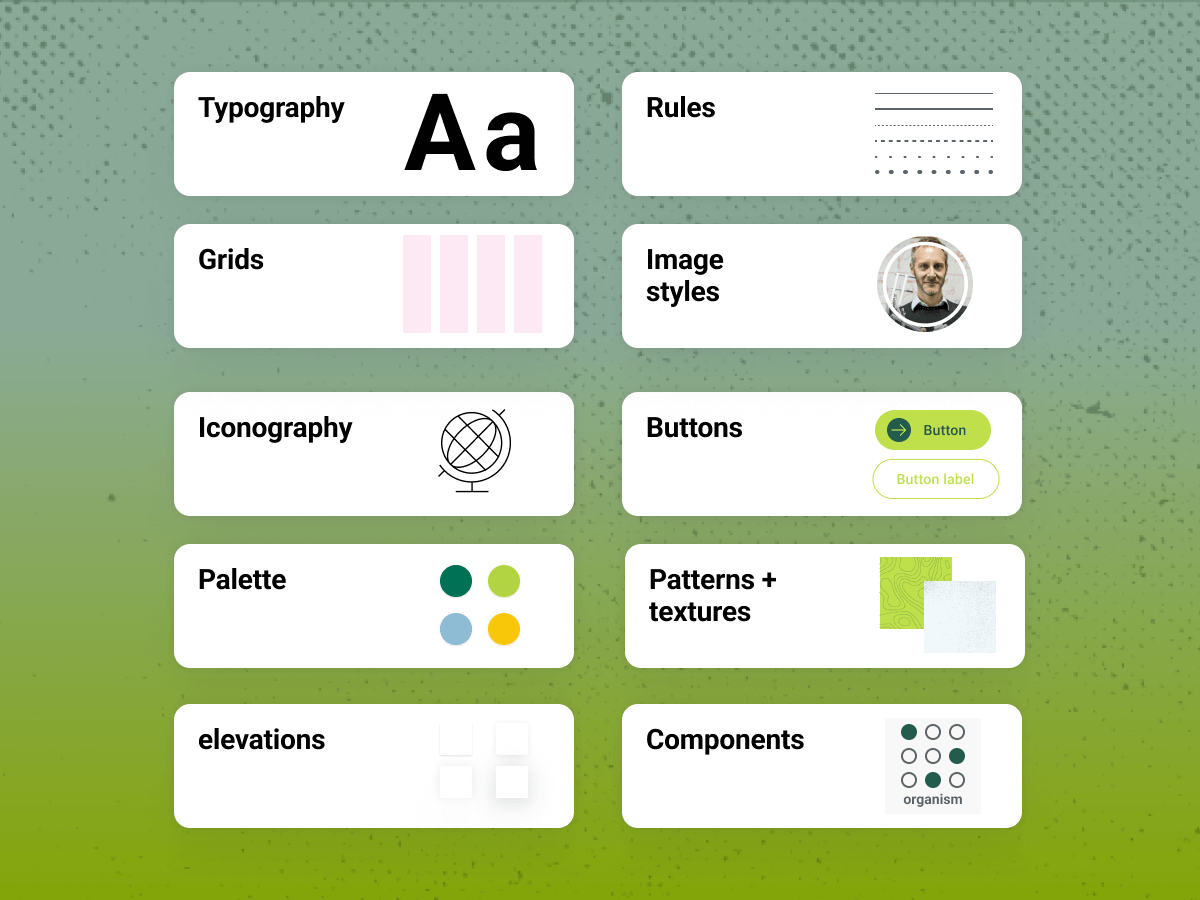
The design of the portal rolled off really easily by working with Figma libraries and the Ivy design system I’ve authored for the university. It has created efficiencies in the design process, handoff and engineering.
I’ve started to extend the design system with web-safe typography guidelines for applying our brand to 3rd party web applications like the Slate Portal, the campus map, sign-on screens, email newsletters and others.
Accomplishments
Improved content hierarchy
An applicant logging in to the portal wants to know the status of their application as well as what their next steps may be. The new design elevates critical content.
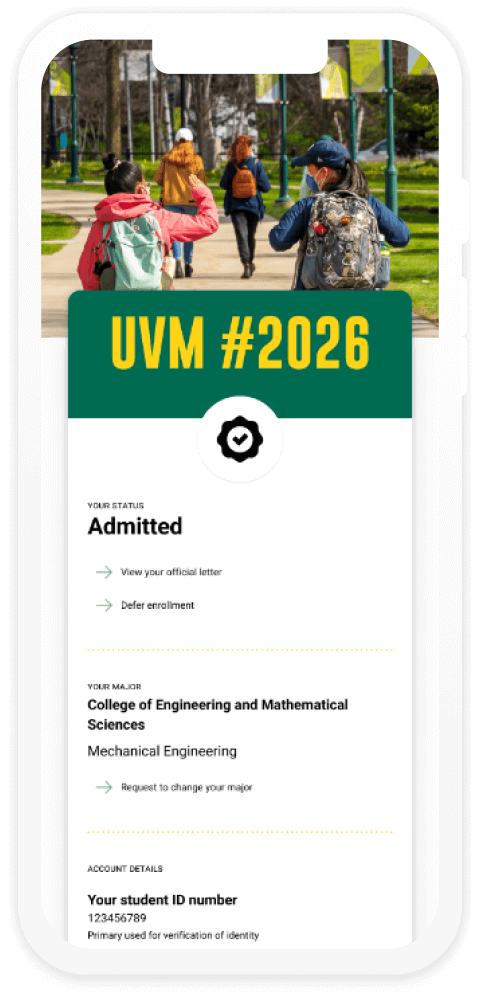
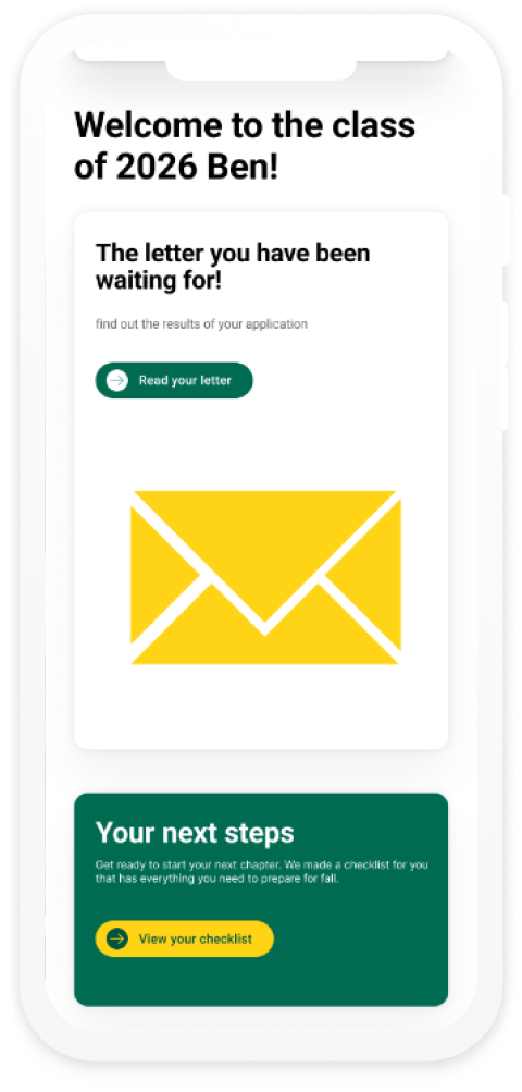
Easy access to the admissions decision letter
Finding out the results of your college application is an exciting moment. The number of help requests showed that prospective students were struggling with the old interface and were having a hard time finding their admissions letter. The links to view the letter were not easily identifiable as links.
The new design elevates this content as well as has a very clear user interface to gain access to the letter.
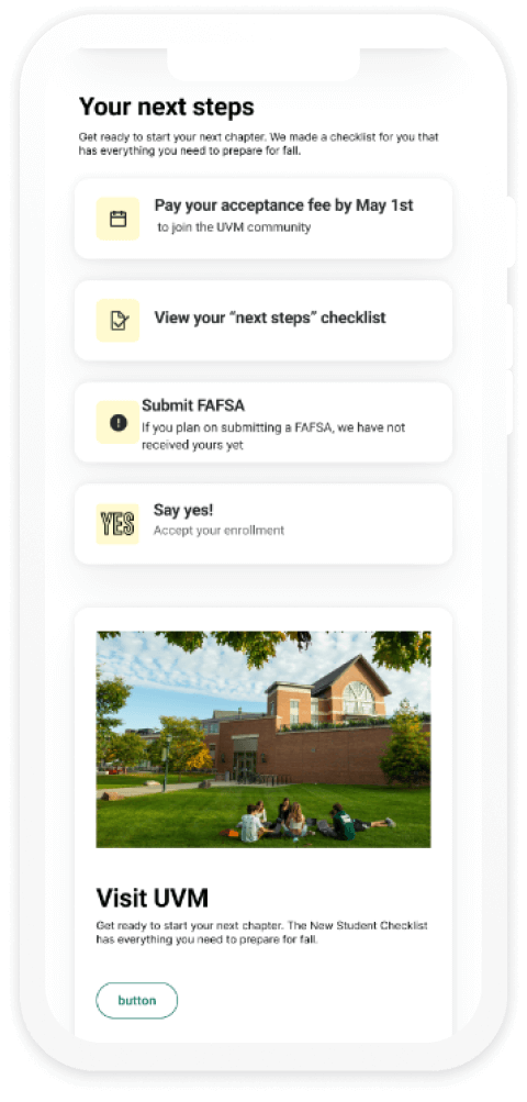
A ‘To Do’ list to help the applicant stay on top of things
The typical applicant applies to 5-9 colleges. That’s a lot to keep track of! The portal provides clear next steps and To Do’s to help prospective students become enrolled students. The list is clear and engaging to interact with.
A ‘To Do’ list to help the applicant stay on top of things
The typical applicant applies to 5-9 colleges. That’s a lot to keep track of! The portal provides clear next steps and To Do’s to help prospective students become enrolled students. The list is clear and engaging to interact with.

Measuring results
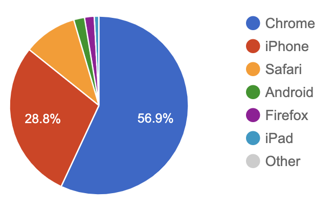
As a UX designer, getting before and after analytics is essential to measuring results.
Since the portal is behind an authentication wall, we were not able to use Google Analytics for usage data and had to rely on the analytics tools that came with the platform.
The pie chart shown here is a 24-hour snapshot of activity. It’s a bit misleading as it combines browser and platform data and the labels are not clear. “iPad”, “Android” and “iPhone” are displaying mobile stats and the rest are desktop stats listed by brower.
Indicators of success
All prospective students have to use the portal, so usage is not related to usability. However, there are some other indicators of the success of the University’s admissions effort and the portal. Here are a few:
- The number of help requests and questions from prospective students about the portal went down
- The volume of applications received increased
- The number of students admitted to the incoming class increased
- The criteria for admissions (GPA, essay strength, standardized test scores) became more competitive
Content strategy and wireframing
The wireframes developed by the team’s content strategist were an important asset to communicate the content organization, hierarchy, and actions that the user could take.
The clarity of the wireframes allowed me to translate high-level business requirements into an engaging UX. Working with the component library of the Ivy design system I created for the university, I was able to quickly identify the optimal display patterns and functionality that would provide the best user experience.
Communicating application status

Awaiting materials
Awaiting decision
Decision released

Wait list
Offered wait list
Application withdrawn

Enrolled
Admitted
Spring start admit
Spring start enrolled
Decision deferred

Denied
Closed out
There are 13 different statuses that an applicant can have within their application journey. A longtime advocate for Steve Krug’s common sense “don’t make me think” approach to usability, I reduced the number of icons from 13 to 4. Rather than having an icon for each, I grouped statuses together into the above categories, greatly reducing the complexity of the icons.
Communicating application status

Awaiting materials
Awaiting decision
Decision released

Wait list
Offered wait list
Application withdrawn

Enrolled
Admitted
Spring start admit
Spring start enrolled
Decision deferred

Denied
Closed out
There are 13 different statuses that an applicant can have within their application journey. A longtime advocate for Steve Krug’s common sense “don’t make me think” approach to usability, I reduced the number of icons from 13 to 4. Rather than having an icon for each, I grouped statuses together into the above categories, greatly reducing the complexity of the icons.
User journey mapping
I employed user journey mapping to help better understand the applicant’s experience at different points of the process and reveal opportunities for us to improve it.
Content can be tailored to work through pain points and blocks to improve their overall experience and the feeling of connection with the university.

Nurturing the relationship
The University’s business goal is to enroll qualified applicants and provide an information path for unsuccessful candidates towards a potential successful application.
The admissions journey is potentially a loop. An applicant who has been denied admission could conceivably reapply successfully at a future date. By delivering user-centric content that reflects their application status and goal of a positive outcome, we can form a better connection and meet them where they are at on their journey.
You may also like
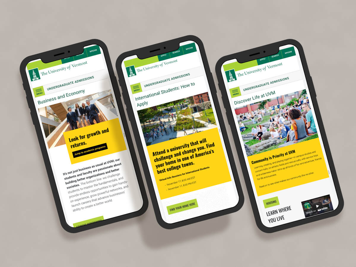
Redesign of a higher-ed recruiting website
Undergraduate Admissions site for The University of Vermont gets a makeover.
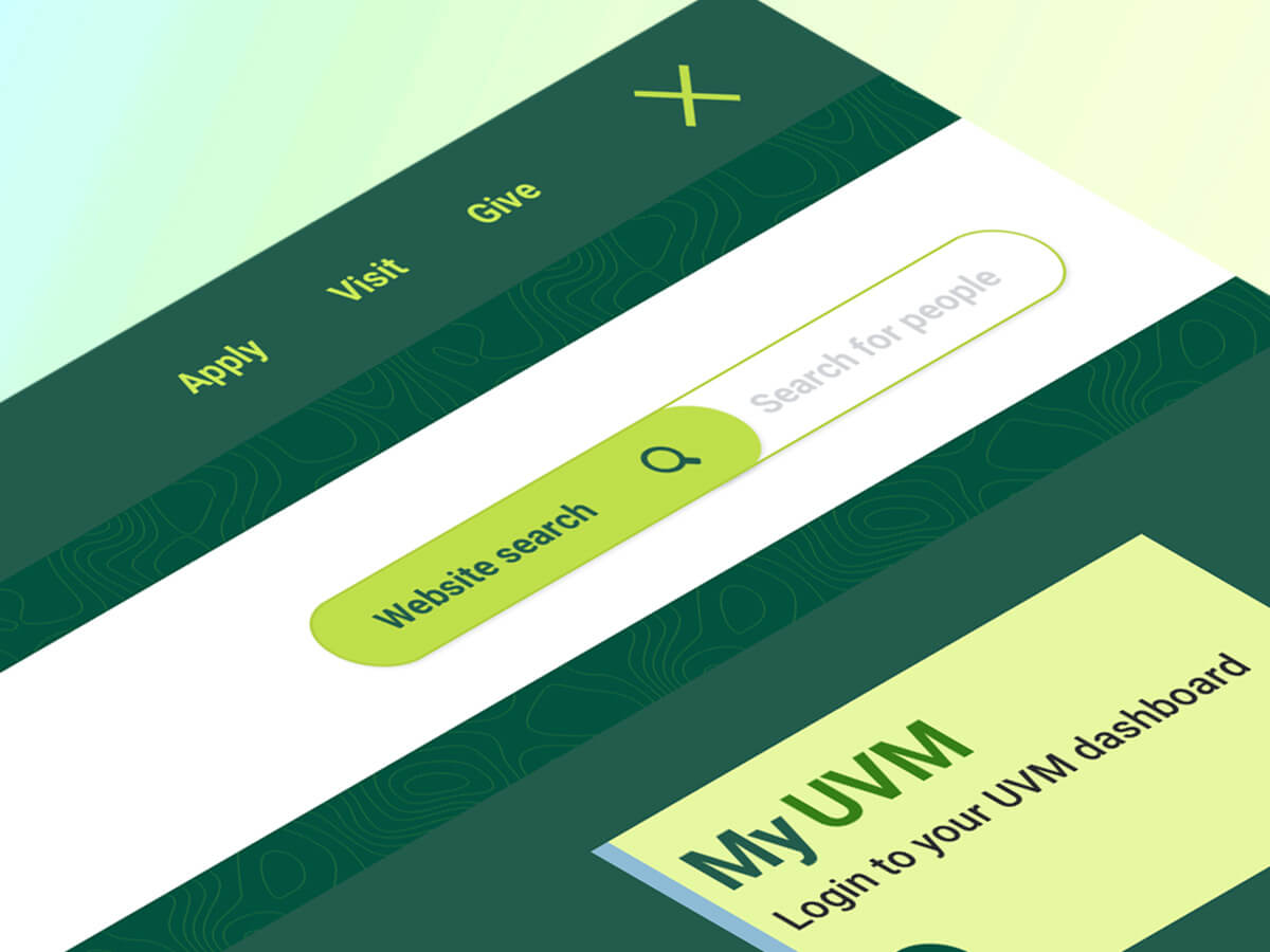
Search interface design
UI and visual design for the primary search interface on a higher education website.
