Evolving a brand using multiple design systems
The University of Vermont
Project overview
Challenge
What do you do when the launch is stopped on a website redesign and the new administration wants a brand shift with an aggressive deadline?
After the surprise, I saw it as an opportunity to showcase the flexibility of the design system I made for the university. It also presented the perfect time to move the design system from Sketch to Figma.
The request for a brand shift with an agressive deadline was a big ask. Fortunately, I had always planned for the brand to evolve and built flexibility into the workflow and the design system.
SOLUTION
- Imported the existing design system files into Figma as a base to evolve the brand
- Populated the new design system called “Ivy” in lock-step with the redesign and brand shift
- Applied Ivy design libraries in Figma to migrated components
- Continued to work with an atomic design approach for all new components
- Interpreted strategy, business and user requirements into scalable, engaging interfaces and digital products
Status
The deadline was met with a newly designed home page, top-tier marking pages and new primary navigation. Websites for the schools and colleges are developed with rolling launches starting in 1Q 2024.
Strategy is in place for migrating all 400+ UVM websites and 1000 content admins to the new system. We are inviting groups of website admins at a time to Drupal 10 so they can receive adequate support to transition and become familiar with the component library and how to work with it.
My Role
- Product Design
- UX Design
- Design System Architect
Tools
Figma, InVision DSM
Link to live work
The team is working in sprints and releasing new components, layouts and pages incrementally.
UVM home page
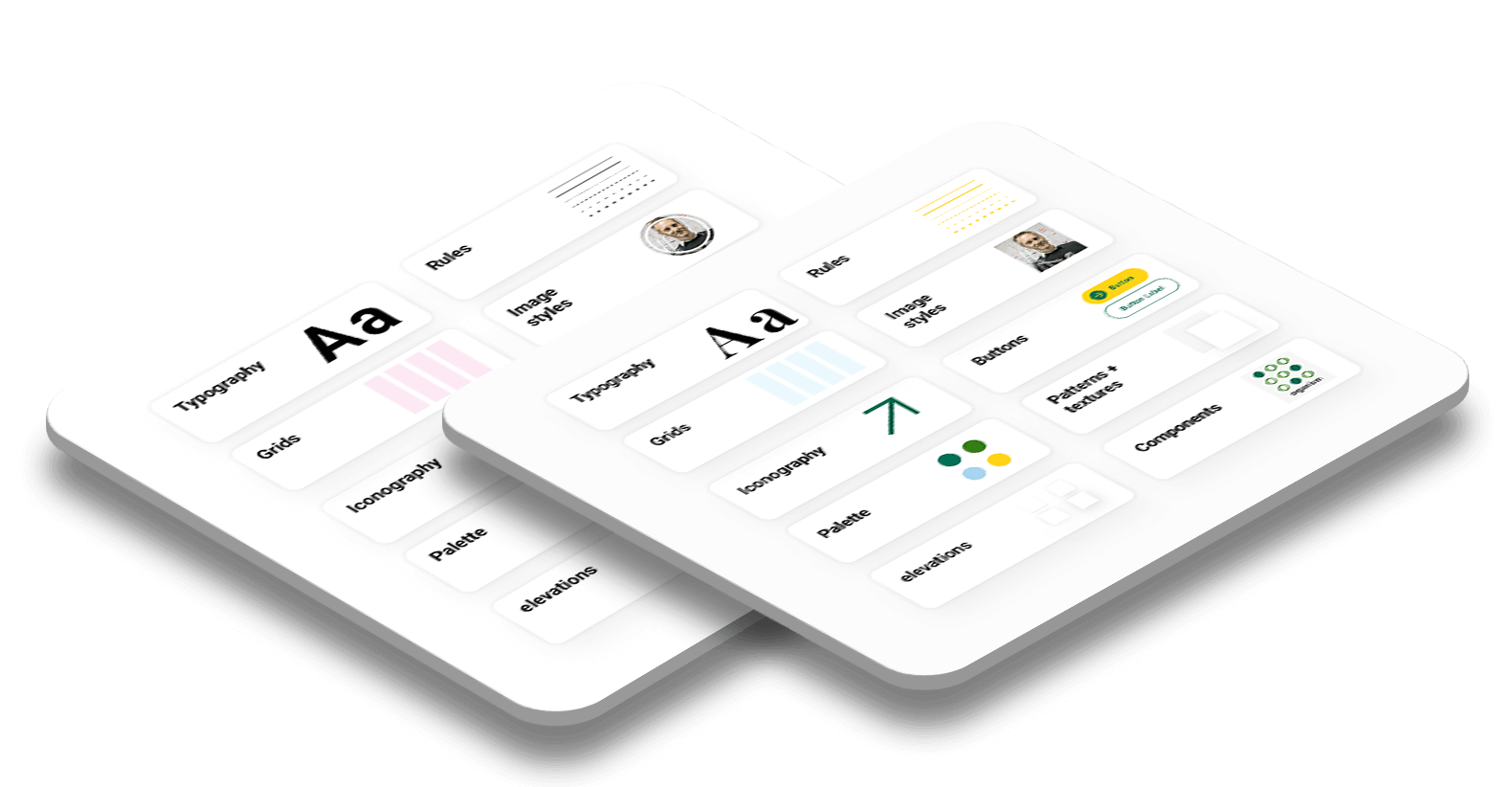
IVY design system
Migrated design system from Sketch to Figma

Employing a multi-brand design system
With the mandate to move the brand away from what was reflected in The Trail Mix design system, I came up with a strategic work flow in Figma using a multi-brand design system. This allowed me to keep the Trail Mix design system intact while creating the new Ivy design system in lock step with evolving the brand.
A massive amount of work had already been done for the design of the website and the creation of the Trail Mix design system. The multi-brand approach allowed me to duplicate the design system, style and component libraries and customize with a new brand direction.


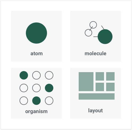
Atomic design with a brand agnostic core
The design system was designed to evolve with the brand whether the changes were iterative or large scale.
On my recommendation, the university had adopted an Atomic Design approach which built in a lot of flexibility to scale to a multi-brand design system. The foundations of the design system – atoms, molecules and some of the components– were designed to be agnostic of the brand. Together they form a core set of building blocks that I was able to re-theme with the new brand-specific styling.
Being able to apply the new brand to existing components saved hundreds of hours of design and development time and gave us the nimbleness needed to meet the aggressive deadline to pivot the brand and launch a new home page.

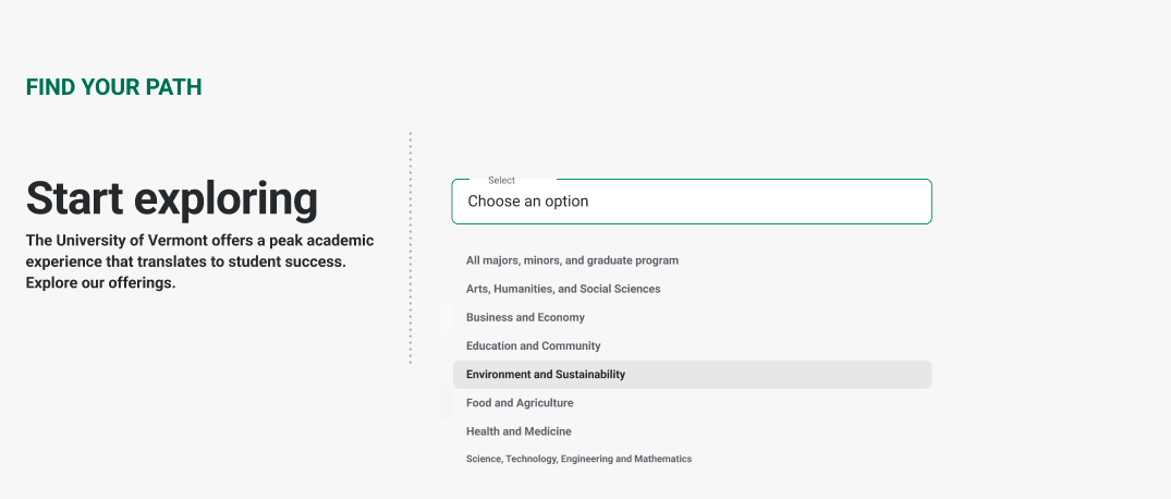
Hero component from the new home page.
Applying the new brand to existing components
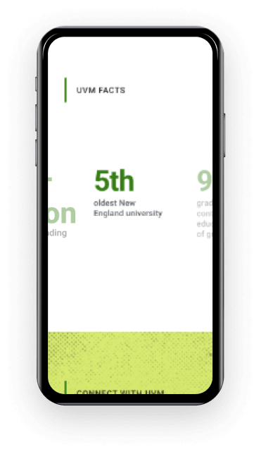
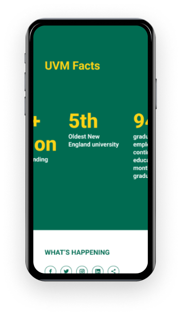
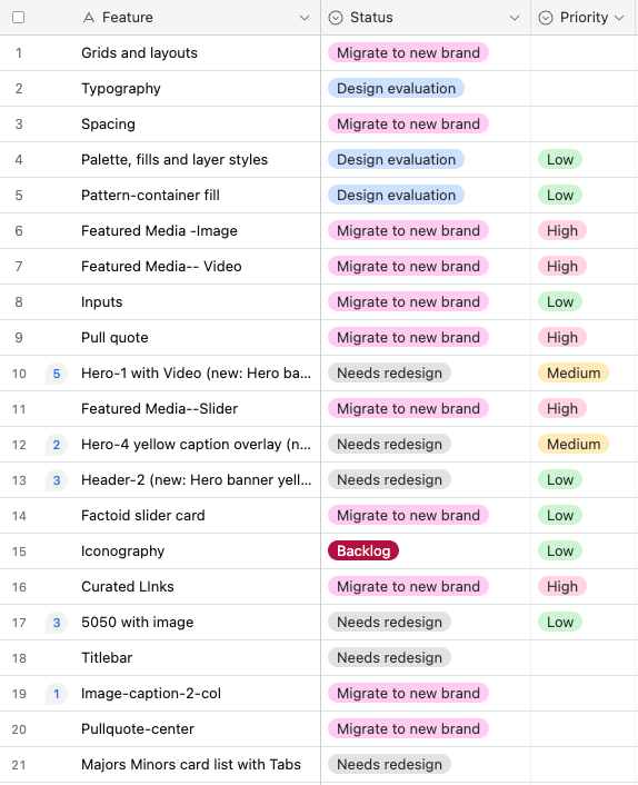
Component inventory
We did an inventory of components in the Trail Mix design system to identify which ones were going to get migrated to the new brand, which needed a redesign, and what new components would be needed to meet our content and messaging needs. This process was done along with a reevaluation of the content strategy.
Palette Changes

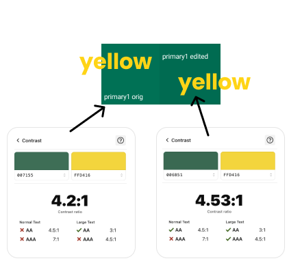
Swapping color palette on migrated components
Swapping out style and component libraries between the old and new brand allowed me to quickly apply the new brand to existing components.
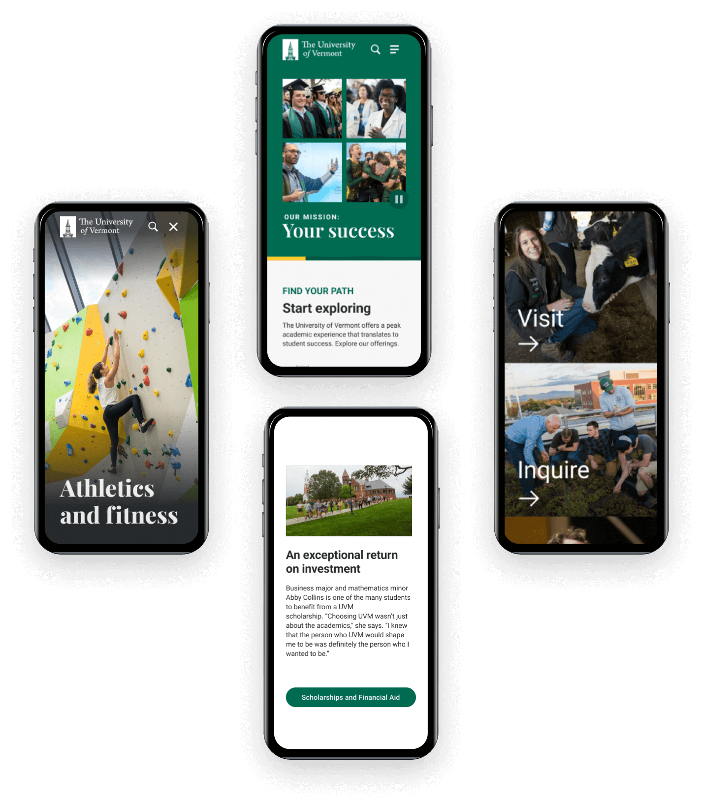
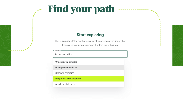
A few screens from the new design working with the Ivy design system I authored for the university.
of hours of design time saved by using a multi-brand design system approach to facilitate the development of a new brand and meet an aggressive launch deadline
HOME PAGE REDESIGN
The new home page moved away from a news-driven focus though news could still be elevated if desired. Call to actions were added to increase engagement and provide clear entry paths for target users.
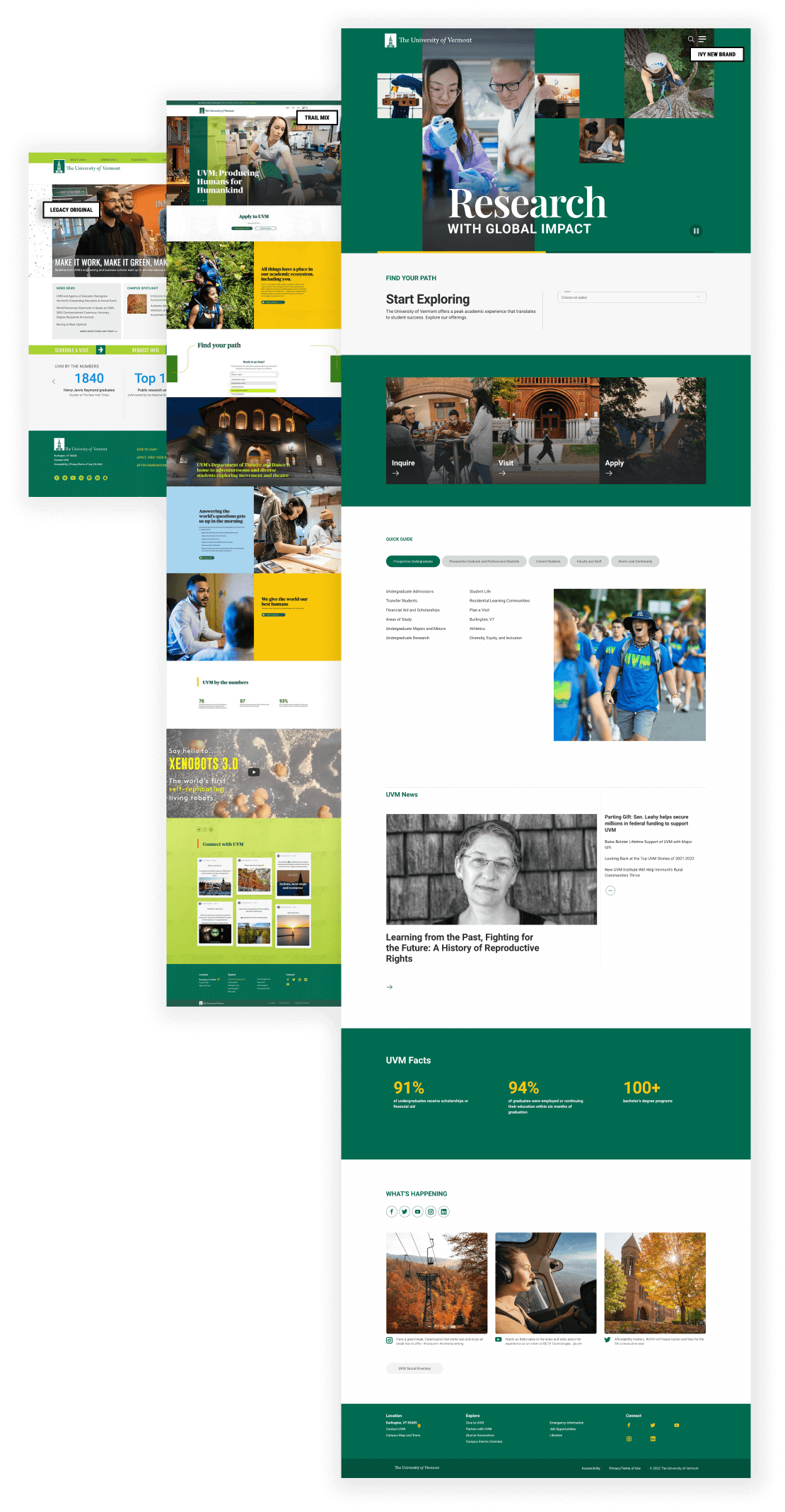
Home page design progression
LEFT Legacy home page MIDDLE Home page that was pulled from launch based on the Trail Mix design system RIGHT New home page now live based upon the Ivy design system.
You may also like
Component-driven marketing landing page
Marketing landing page design to raise product awareness for B-Corporation Seventh Generation.
Search interface design
UX and visual design for the primary search interface on a higher education website.
