Search interface redesign
Product design, UX Design
Project overview
Challenge
The interface of the search tool needed to be improved to make it more intuitive and allow the user to take advantage of the dual search functionality. Multiple text entry areas created a confusing interface, violating the “don’t make me think” foundation of good UI design. The execution was flawed. Text entry text goes outside of the text entry fields.
Goals
- Allow users to easily find content they are looking for
- Simplify the search UI so that users are not required to pick among multiple search interfaces and text entry boxes
- Plan for both a keyword and people directory search
- Plan for scalability for the potential of future additional specific searches or filters for course catalog, academic programs, news, images, and offices
Audience
The search tool serves both internal and external audiences.
Internal audiences include students, administrators, faculty, and staff. External audiences include prospective students and their parents and caregivers, press and media, prospective employees, community members, research partners and other universities.
Scope and Constraints
The University is using Google Custom Search Engine (GCSE) for their search tool. It’s free and has limited customization for both design and results filtering.
My Role
- UX Design
- Visual Design
- Product Design
Tools
Figma, Sketch, InVision DSM, InVision Freehand, InVision Prototyping
Status
Interface passed usability tests. Project assets getting migrated to Figma and are in pre-flight to the Trail Mix design system in InVision DSM for hand-off to the development team.
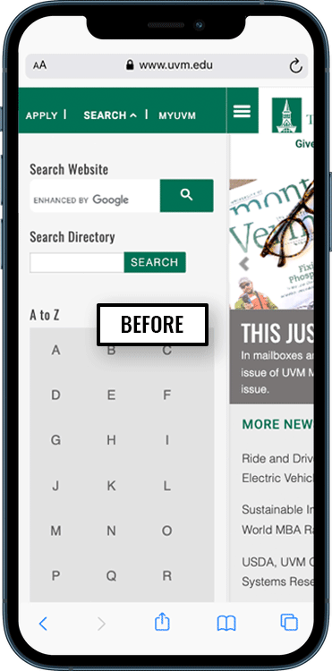
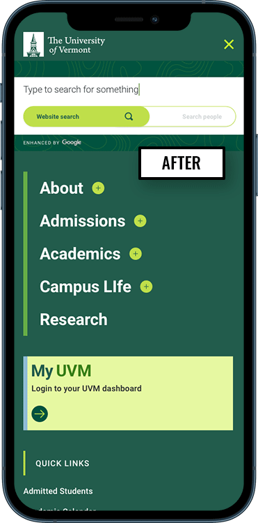
Issues with current search tool
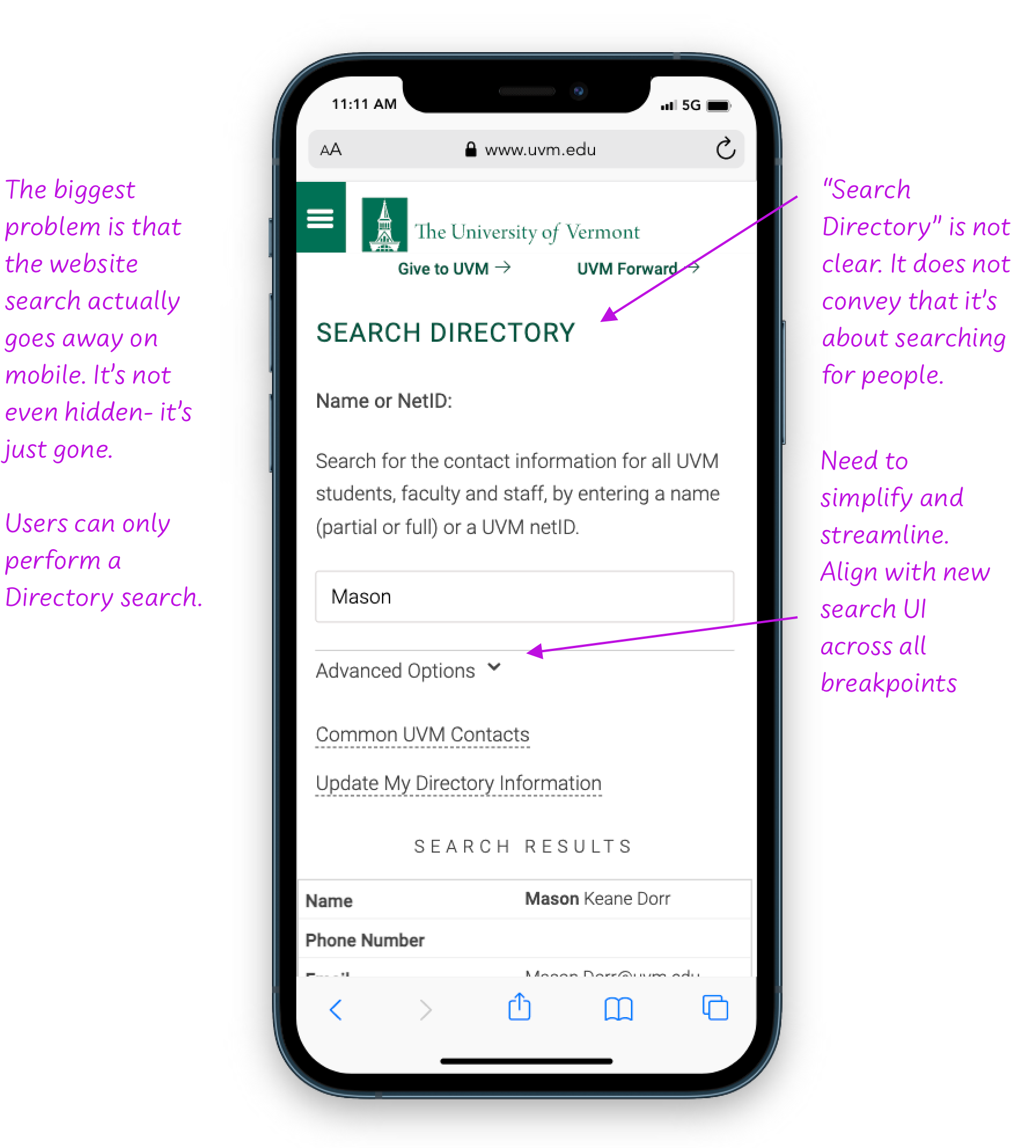

Role and accomplishments
As the product designer on this project, my role was to interpret the project brief into wireframes, iterate at wires through design approval, hand-off to the dev team and perform QA.
- Discovery review of search interfaces in use at institutions and higher ed
- Research customization possibilities for Google search tool
- Created pencil sketches to quickly iterate interface options to meet both immediate and future needs
- Created interactive wireframes
- Skinned approved wireframes with design
- Planned for responsiveness and created designs for each breakpoint.
- Pre-flight and hand off to the development team
- Linked to atomic elements within Trail Mix, our design system
Planning for future functionality
The creative brief specified 2 phases of the search tool redesign:
Phase 1: Improve UI of existing search functionality where users can search either the People directory or the website
Phase 2: Filterable search and advanced search where user could narrow their search to specific areas of the site, for example, course catalog, academic programs, news, images, or offices
This brought up the question: should the search be narrowed before or after the search with filters?
These wires show two different UI approaches that would allow for this scalability in the future.
Analytics
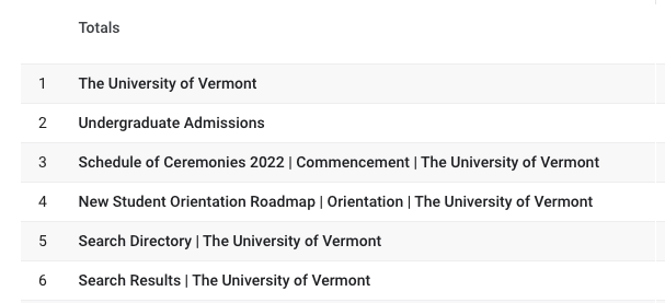
Before starting the project, we looked at the analytics over a period of time. The Search tool on the site is well trafficked and consistently places high on the “pages visited” list. In this grab from the analytics dashboard, Search is the 5th most visited page on the website. It’s worth noting that the existing search tool is called Search Directory, and includes both the people directory search and website search.
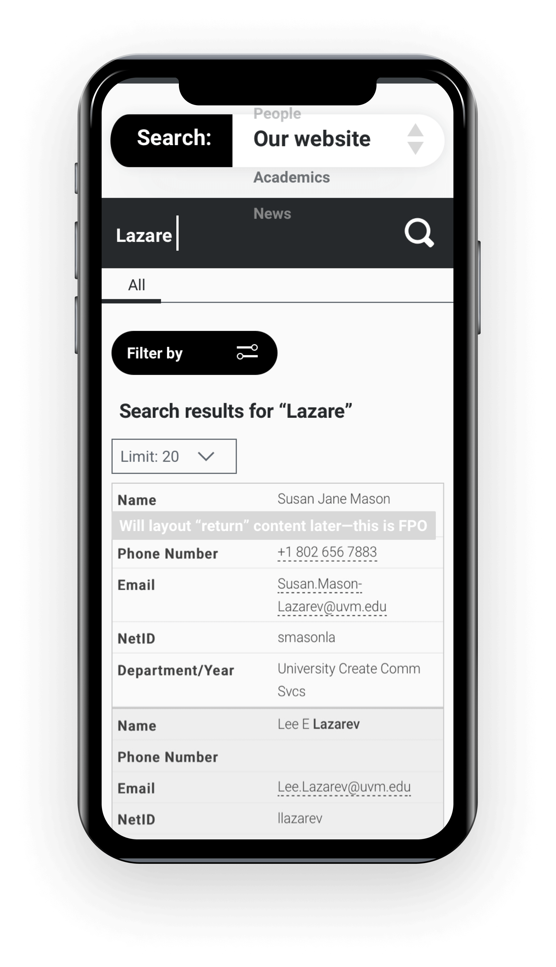
Wireframe exploring the option of pre-selecting the area of the site you want to perform a search. You can then further filter the search return results.
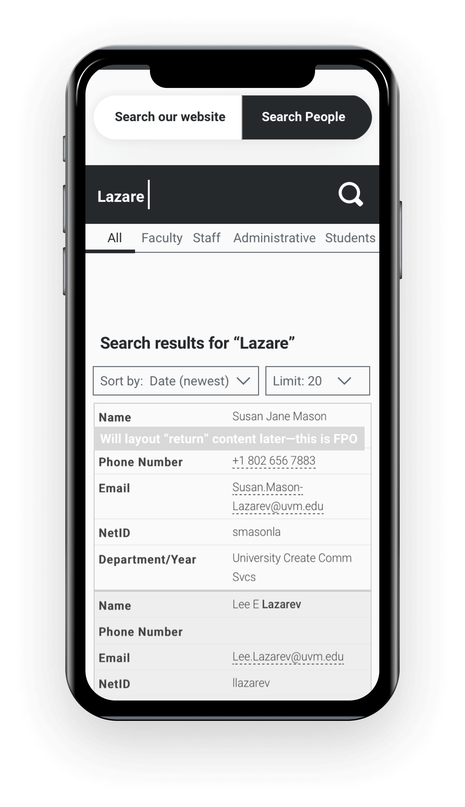
This wireframe shows functionality to perform either a website search or a People search and then further filter the returns. The wire is showing a People search with filters for faculty, staff, adminisrative and students.
Planning for future functionality
The creative brief specified 2 phases of the search tool redesign:
Phase 1: Improve UI of existing search functionality where users can search either the People directory or the website
Phase 2: Filterable search and advanced search where user could narrow their search to specific areas of the site, for example, course catalog, academic programs, news, images, or offices
This brought up the question: should the search be narrowed before or after the search with filters?
These wires show two different UI approaches that would allow for this scalability in the future.
Analytics
Before starting the project, we looked at the analytics over a period of time. The Search tool on the site is well trafficked and consistently places high on the “pages visited” list. In this grab from the analytics dashboard, Search is the 5th most visited page on the website. It’s worth noting that the existing search tool is called Search Directory, and includes both the people directory search and website search.

Results
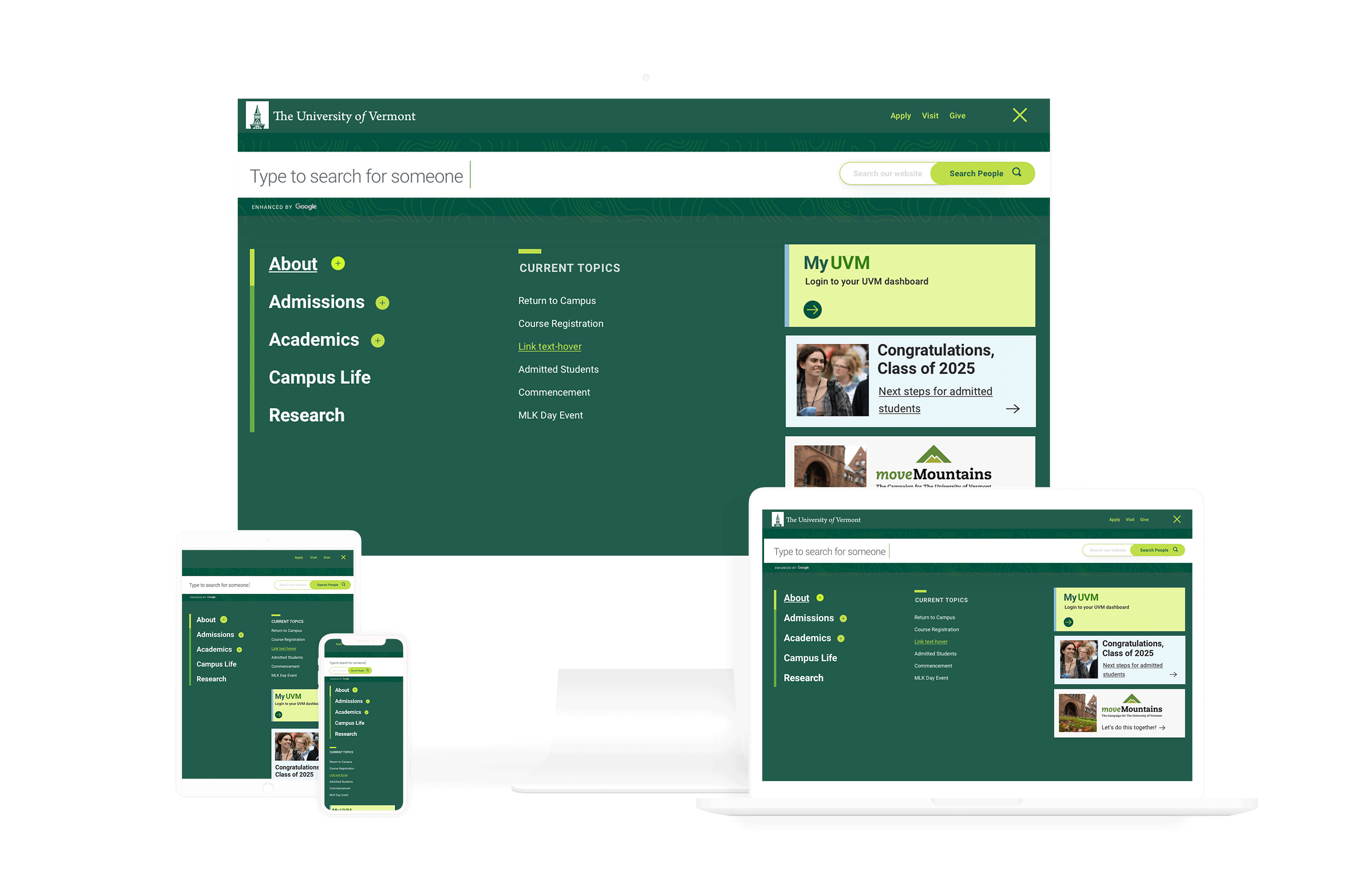
Simplified interface
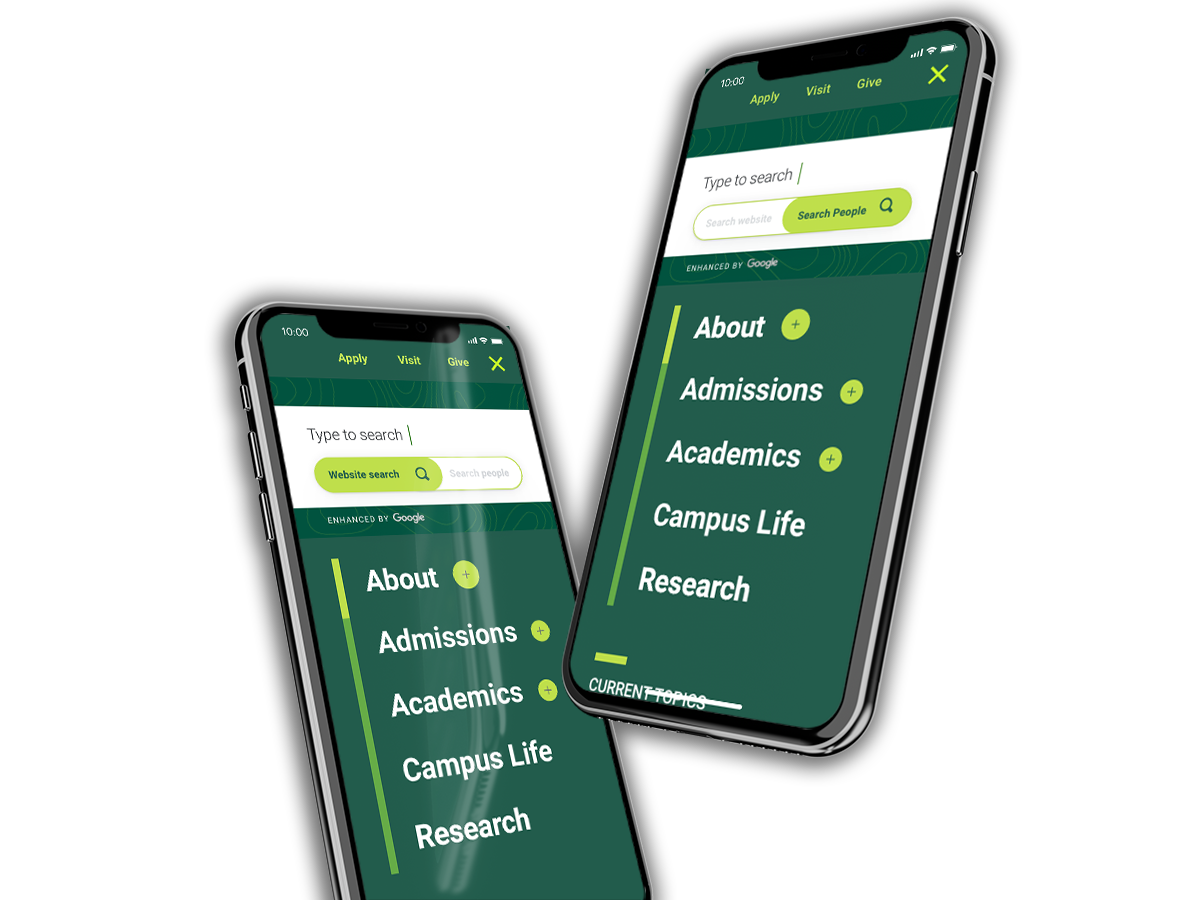
The interface has been streamlined to one, full-width search entry box with a toggle to provide both a simple keyword search as well as a people directory search in one place.

Easy to find
Users need to be able to find the search tool easily. The magnifying glass icon is a universally recognized symbol for Search.
The main navigation and header was designed at the same time as the search interface. We went with a takeover nav launched from a combination hamburger menu / search icon which was placed in lockup with the menu icon in the upper right corner in the header. It is persistent and always accessible.
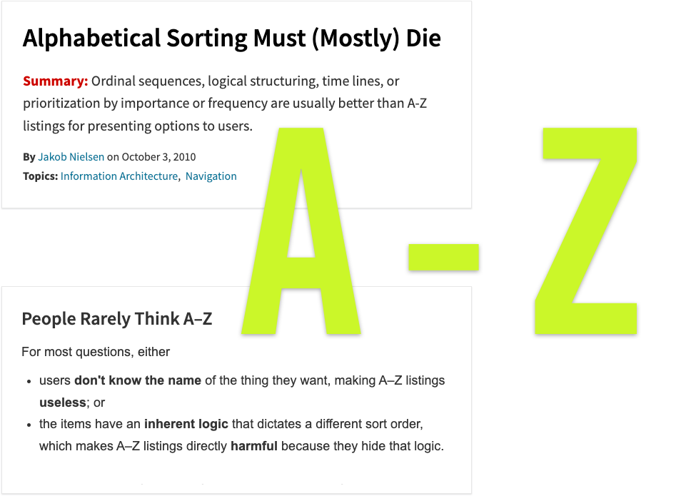
Deleted A-Z search
There were a lot of reasons to ditch the A-Z lookup in the existing search. Nielsen Norman was recommending against its usage as far back as 2010. Plus, the A-Z directory is time consuming and difficult to keep up to date.
The decision was made to improve and streamline the functionality of the search interface and move away from the additional A-Z search tool.
Added hint text
Hint text is provided for both the site-wide keyword search and the directory search to make it completely clear what users can search for when selecting the toggle.
Kept auto suggestion
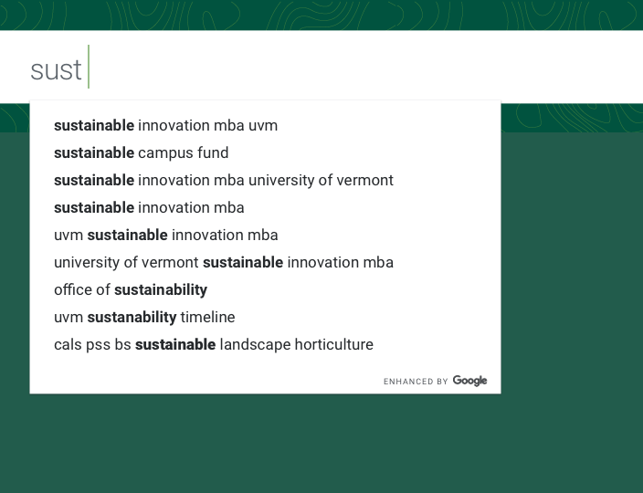
Google’s auto suggestion feature that provides real-time returns as the user enters type into the text entry area was kept.
The goal is to help users find what they are looking for with as few clicks and as fast as possible. This functionality is in align with our goals.
We are going to be measuring and evaluating the return value of this versus speed during QA to ensure the experience is accelerating search returns.
You may also like
Perfecting the split content block
Various design approaches for this hard-working and ubiquitous design product.
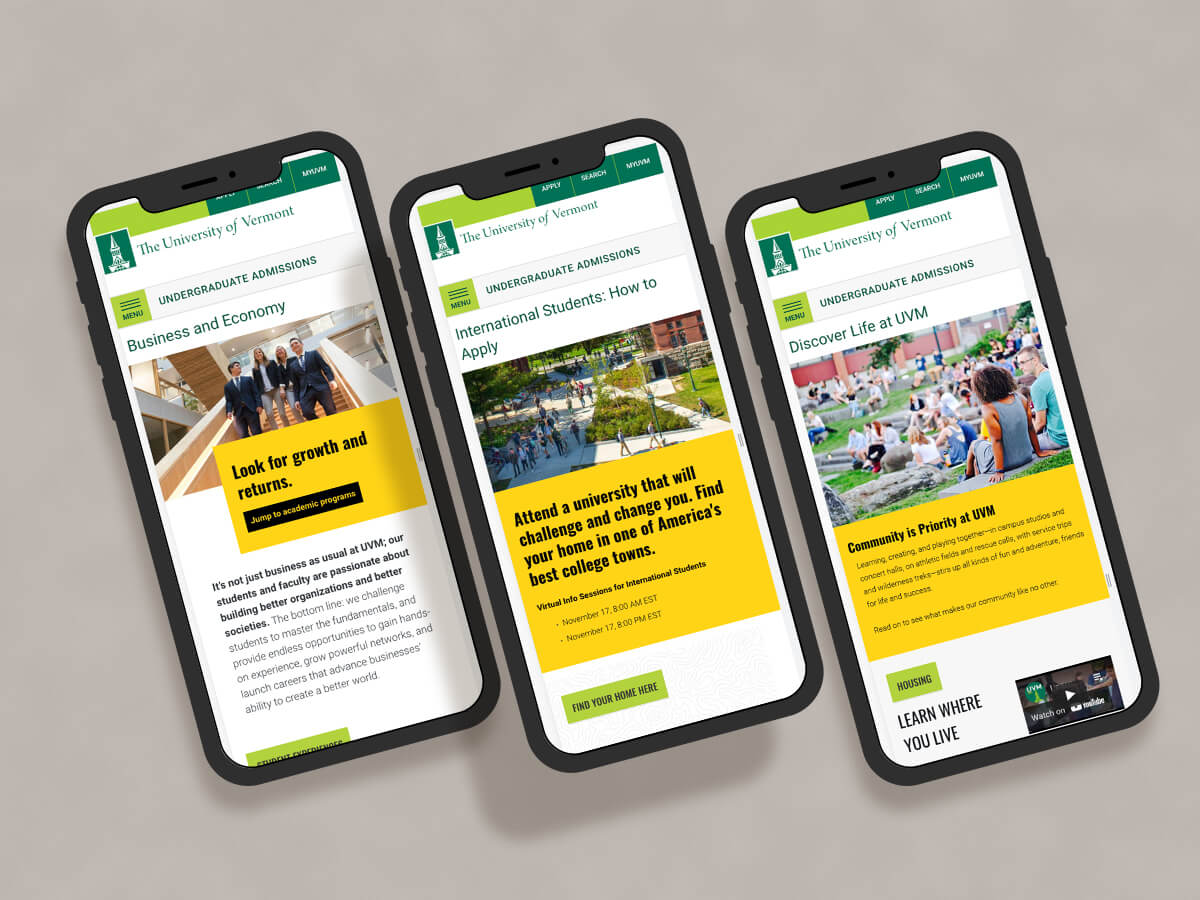
Redesign of a higher-ed recruiting website
Undergraduate Admissions site for The University of Vermont gets a makeover.
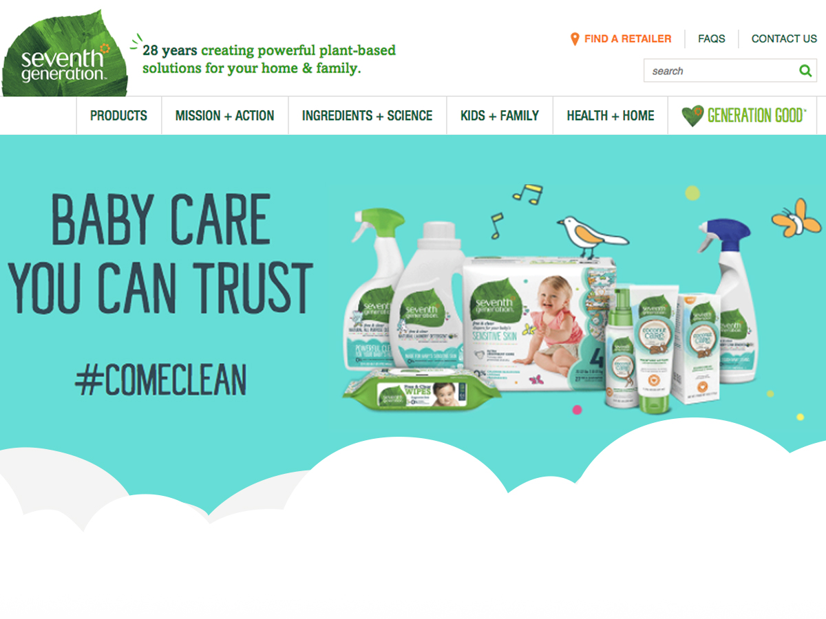
Marketing landing page
B-Corp Seventh Generation needed a flexible component-driven marketing landing page for their baby products.

